The exposure triangle
When considering photography, the effect you're trying to achieve and understanding mistakes, one must first understand the exposure triangle.

Covering three elements; ISO, shutter speed and aperture, the exposure triangle affects how an image communicates; light, depth and movement. They all work in combination with each other and no one element can be altered with affecting the other two.
ISO - is the sensitivity to light on the film (or digital image). Represented in number format, roughly speaking the lower the number the less sensitive to light but also the less noise is recorded on the image. For example in a dusk/fading light setting one might choose an ISO of 800 to record the low light levels through the clouds, however the image might appear grainy. ISO 100 produces the least amount of grain but requires more light to achieve a well exposed shot.
Shutter speed - is how quickly the shutter within the camera opens and closes. The faster the shutter speed the more 'frozen' the subject will appear. A slower shutter speed can be used to create a sense of movement, however more light will enter the camera and therefore the ISO may need to be adjusted to ensure the image isn't over exposed. Shutter speed is recorded in terms of time, fractions of a second, with 1/5 being quite a long shutter speed and 1/1200 being a fast shutter speed. The longer the shutter speed the more camera shake is picked up, so a tripod is required.
Aperture - is the size of the opening. Not only affecting the amount of light that is recorded, this also affects the depth that is in focus, referred to as 'Depth of Field'. Aperture is recorded in 'stops' that refer to the fraction of diameter that is allowed to open. The bigger the number the smaller the window, the smaller the window the less light is allowed to pass through to the sensor or film. If a shallow depth of field is required a larger aperture is required (a smaller f stop).

 |
| Examples of varying depth of field. Examples of my images that illustrate shallow depth of field and bokeh  |

Cameras
Film camera's use a chemical reaction between the film and light to form the negative, the amount of light and therefore the appearance of resultant images depends on the three components of the exposure triangle as described above.
A digital camera however, does not use film, but uses the same principles to record light through a sensor, the size of the sensor links to the size of the image (as with film photography) but rather than store the image or negative in a film which then has to be processed, the camera transfers the information onto a digital memory card.
Digital SLR camera's allow you to work in;
Manual - where the user defines all the settings.
Semi automatic - when the user determines one of the elements in the exposure triangle and the camera automatically adjusts the others
Full auto - where the camera is set by the programme selected and all elements of the exposure triangle are determined by the camera.

Film and File formats
Stemming back to its contact plate history, film size was referred to by the size of the print it produced or by the name of the camera it was used for. However, as research was carried out to make camera's more affordable, and easier (not as bulky) to use, developments and technology used in the cine film industry were transferred to photography and still images.
Still relating to size, but this time the length of the negative, Kodak introduced the concept of film being contained in a 'spool' or cassette and initially sold a camera with the film preloaded, with the camera sent away for developing and reloading.
Films were then produced so that the cassette could be removed in daylight, so only the film was required for processing. Various film sizes were available dependant on the camera in use.
Medium format film measured 6x4.5/6x7cm.
Later 35mm film was produced, again using cine technology, by Leitz. 35mm remained the most common and popular film format for everyday photography.
Polaroid also introduced instant camera's which used a loaded cassette and produced an instant image on photographic paper.
Today's digital camera's use a sensor rather than film, and record the image on a memory card. The sensors size varies in a similar way to that of film.
The way images are stored can vary and different file formats are available dependant on the requirement of the photographer.
Jpeg - a form of compression that reduces the file size substantially, allowing more images to be stored on a memory card.
TIFF - uses slight compression
RAW - closest to film quality and requires a lot of memory, the file is not processed or compressed.
In terms of picture quality, the more compressed a file, the more detail can be lost, so for editing and professional photography RAW files are used.
Asset handling and management
During the course of completing this assignment, it's safe to assume that I will take, manipulate and print many pictures. Some will be used to demonstrate techniques and ideas, some may be discarded, and some will be used in the final stages of post production and selection for the end portfolio. As such it's important to store, collate and categorize these images effectively to save time and/or loss and damage of images.
Most of my work will initially be digital, as I use a digital SLR camera as my main source of recording. As such a it is important to have some kind of digital back up, as technical issues can affect the integrity of digital files, and at worst a technical failure can cause complete loss of data.
In order to avoid any kind of corruption of loss, I use the following methods;
SD cards - multiple cards of 'small' capacity are used during shoots.
I have taken this decision for a number of reasons. The SD card is the first component used in recording images. My camera does not have the capacity to use two SD cards at the same time to have a duplicate 'back up', nor do I have the capacity to wireless-ly send pictures directly from the camera/SD card direct to a PC at the time of shooting. With this in mind, my shots are vulnerable should an SD card have a malfunction, as at that point they are the only copy of work. As a novice, simple shoots with lighting set ups, or even out on location, can take some time, with 100's of shots being taken for experimental and learning purposes. If I use several 'small' capacity cards (4GB) during the course of a shoot, and a card malfunctions, then only a small percentage of work will have been lost, as opposed to a full set of images if I were to use a single 'large' capacity SD card (10MB).
I also ensure that at the end of each day/shoot/set all the cards are cleared as appropriate to ensure sessions don't get mixed up, or left in the vulnerable position of not being backed up/duplicated.
External hard drives
My laptop has a relatively large dual core physical memory system, which totals 250GB, one might assume that this is large enough to collect the images from an SD card, however, as with all technical equipment, malfunction can occur which results in corruption and/or loss of data. I therefore use two external hard drives to duplicate the contents of my laptops hard drive. The files include not only images, but also course notes, thought processes and word documents which contain the wording of website/blog entries.
One drive is a 500GB portable hard drive which is small enough to be carried around at all times (enabling me to save things from multiple computers and sources), and a 1TB powered hard drive which remains in situ at home and includes surge (power) protection and a monetary guarantee from the manufacturer (however, that would be insignificant if treasured memories or important work was lost!)
I also password protect my external hard drives to add further protection should anyone wish to access files without permission.
Online storage
Even with my current laptop, and external hard drives, physical equipment is still susceptible to technical failure, so with that in mind I have opted to further back up my work by utilizing an online server. Online servers back up selected data files and make an electronic copy on an off site server. Data is further secured by using various encryption processes as well as being user password protected. Files can be accessed from any PC with an Internet connection, and this can be used to sync various devices, and also to share work for collaboration purposes.
After some research, considering reputation of company, encryption standards and price of ongoing storage, I have chosen to utilise free data allowances with Microsoft SkyDrive and Virgin Media V stuff for personal and family data, and use a paid service by Dropbox for course work.
Physical storage of printed/physical media
Printed images by their very nature, can easily be damaged by graceless handling. Printed images should be handled with care, wearing gloves where required and employing a gentle 'grip' trying to utilise the 'edge' as much as possible to avoid any contamination of the print itself.
The conditions in which printed/physical media is stored can affect its condition and lifespan, as they can be altered/damaged by humidity, light, ph and temperature. In order to preserve for as long as possible media must be stored in a cool dark area in an area that will retain a moderate humidity. The paper on which the image is printed and the ink can also effect the lifespan of the print and there are industry articles and tests by which one can make informed choices but no industry standard. Papers, storage boxes and plastic envelopes can all be purchased to store and catalogue physical media, but quality varies. There are some national and international quality standards that storage materials can conform to, these offer the best possible variables to safely store items.
ISO 18902, provides specific guidelines on albums, framing, and storage materials as well as requirements for photo-safety and a specific pH range for acid-free materials, it also excludes the usage of harmful materials including PVC and Cellulose nitrate.
Digital data organisation
Organisation is a very personal practice, and each person will develop their own preferred method of cataloguing, naming, and tagging their own collection of work. I consider myself a very organised person and like to keep the same method of naming and file paths throughout all my systems. I keep the camera generated name on all my images, but rename the folder dependant on its use, subject and date, For example work for this unit will be placed in a folder named Unit 4 Objects and would have a file path of Device name/Pictures/Uni Work/Unit 4 Objects/Macro/Brush/Test Shots/DMC_00125.
(Objects is the name of the unit, Macro is the area of exploration, Brush is the chosen subject pictured, Test shots are ideas and prep work and not yet manipulated, followed by the image name. I might also have a post production and Final folder with the Brush folder)
These file paths are recreated on the back up drives and the catalogues within Lightroom, to create a consistency and to help aid quick retrieval.
Lightroom is a computer programme which is part of the Adobe range, it is used to view thumbnails and rate them using colours and/or star systems, perform non destructive editing which can then be carried out in Photoshop, as well as organise print jobs, create contact sheets and publish to the web. I particularly like and use the colour identification system to easily and quickly identify images I like, and would consider for post-production and/or print, as well as the ease in which I can produce contact sheets with EXIF data.
--------------------
Equivalent Exposure - researched piece
Equivalent exposure is a hard concept to grasp at first.
SHUTTER speed numbers like 1000 and 500 are all a fraction of a second of time for how long the shutter will let in light. These numbers are 1/1000 or 1/500. Looking at this as a FRACTION we see that the larger the number the less time the shutter will open to let in light.
The shutter speed numbers each double the amount of light they let in as we move down the dial. 1000 - 500 - 250 - 125 - 60 - 30 and so on, each lets in double the amount of light.
APERTURE numbers or f-stops are also a fraction. The number f 16 is really 1/16th and f 2 is really 1/2.
They represent the fraction of the opening created by the aperture or lens blades - if you take a 50mm lens, the size of the opening in the lens that lets in the light is compared to this number. F2 represents a lens opening that is 25mm wide.
Each aperture or f-stop also lets in double amount of light of the next one on the setting chain, just like the shutter speed dial.
So as we look at the numbers we see these: 16 - 11 - 8 - 5.6 - 4 - 2.8 - 2 which as it turns out allows for a doubling of the amount of light in each one. They do not look like they do in the math because we are talking AREA in the size of the circle or HOLE that lets in the light.
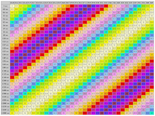
EQUIVALENT EXPOSURE
If we have a normal light meter setting of 500 at f11 for a subject and we want to open the shutter up for a LONGER time to allow for blur and thus we set the shutter to 250 we now must adjust the aperture to KEEP THE LIGHT THE SAME as it falls on the film. The shutter was set to let in MORE light so the aperture must be set to let in LESS light to keep the amount equal. So, we move the aperture to f16 and now we have an EQUIVALENT exposure. If we move the shutter to 125 the aperture would move to f22 which is about as small as most cameras will go. All of this works because each setting of the aperture AND the shutter are each half or double the one next to it.
Notes
When using equivalent exposures and changing settings for light compensation, care should be taken and consideration made for element changed I.E. - if you use a longer shutter speed, you may get a well exposed shot but you may encounter motion blur, if you increase the aperture opening then this will affect Depth of field and the overall focus point of the composition.
Here are some images I found to further help explain equivalent exposure - images from Google Images/Flicker
Here are some images I found to further help explain equivalent exposure - images from Google Images/Flicker


--------------------
Studio Introduction
This section will cover the equipment that was introduced today in the studio,
The studio is well lit with natural light and also incorporates a skylight, the amount of natural light can be manipulated by use of the black out blinds.
There are several lights held within the studio store these include;
Tungsten lights - these (in this case) are small floor units which produce a directional light which can create a yellow or warm cast. They also become very hot after a few minutes of use.
Electric flash heads - these heads can vary in size and vary in output/brightness measured in watts. These lights do not get hot and are sometimes referred to as cold lights. As the work on the same principle as a camera's flash they are linked directly or wireless to the camera by way of a remote trigger and flash when required - so that the users can see between flashes a model bulb is installed showing the light in proportion to the wattage setting.
Continuous light - these lights are as the name suggests, continuous sources of light. They do not link into the camera by way of lead or remote but supply continuous light .
Light stand (unless a railing system has been fitted and the studio is ceiling based).
 |
| Tungsten Light |
 |
| Electronic flash unit with wireless trigger |
The light can be directed or diffused by adding modifiers;
- directs the light into a specific area
Snoot - directs the light into a smaller concentration of the studio are
Honeycomb grid - attaches onto a modifier to further direct light.
Gels - can be placed over the light in isolation or in combinations using a dedicated holder to create colour effects
Soft boxes and umbrellas - diffuse the light creating a softer effect. These should be size relevant in relation to the subject being photographed
 |
| Modifier and honeycomb grid |
 |
| Lightbox |
Backgrounds and poly boards can be used to create blank backgrounds and/or to add and subtract light. A white poly board, for example, at the side of an object and opposite to a light source, will help reflect light back onto the subject matter.


--------------------
Studio session with client
Work based studio exercise, in which the client wanted a studio session to create some professional portrait images.
The images were for the clients own personal collection to commemorate her 21st birthday and the shoot needed to include one 'fun' shot which was to be framed as a gift for her parents.
I met the client for an informal chat with a collection of portrait work to get an idea of style preferences and any specific requirements. We booked a mutually convenient date to meet in the studio, with my mobile and email at hand, should the client have any questions or issues.
The client asked me to visit her again before the shoot to pick out some outfits , which was an opportune time to build rapport in a comfortable environment before the studio session.
Rapport is important, as it puts the client at ease and gives you the best opportunity to capture their true image & personality.
Whilst I was there I also made a mental note of the music that was being played, so I could play similar music in the studio - again to make the client feel comfortable.
I asked the client if it was OK to work through a couple of lighting set ups to maximise the different effects in our short session, the client was fine with this and brought a book for in between shots.
 |
| Example of back light |
 |
| Single light in front and above subject some times referred to as 'Butterfly light' due to the shadow under the nose. |
Here are just a few unedited shots to illustrate the different lighting equipment that was used.
All the lighting used is 'mid' key, so there are shadows but there are still details in the shadows.
Low key lighting would have much darker shadows with no detail in those areas, and high key lighting would offer little or no shadows
 |
| Gels used to create a coloured effect |
 |
| Single light source with reflector creating dramatic shadows There is still detail in the shaded face This technique is used to create the 'Rembrandt' when a triangle of light is seen on the shaded half of the face on the upper cheek bone. |
--------------------
CD cover brief
I choose the following song which can be viewed using the following link
Lady Antebellum - Need you now
A CD cover measures 12x 12 inches and needs to have room for artist information and song title so that needs to be considered when thinking about the subject and the way the image is captured (angle/background etc)
My original concept was to pick up on the 'lonely hearts' feel of the lyrics and video, and also pick up on the idea that part of the song was a telephone call. Knowing that there was a traditional red telephone box nearby, I visited a location with my volunteer model. I wanted to get a very shallow depth of field, focusing on just the models rinds, with the rest of the image out of focus but still recognisable.
These are some of the shots
 When I looked at the shots, while they did tie in with the theme and mood of the song, I wasn't 100% happy with the depth of field. I was also unsure about the composition of the sots either, and wondered if a simpler idea would still capture the mood, but have more impact.
 I was sitting in a coffee shop listening to the song, when the table in front of me seemed to fit the bill exactly!

I took a few shots to get the composition and lighting right, as the cafe was very dimly lit.
I then used photoshop to re size the image to the required CD spec, adjusted the saturation and contrast to create a 'darker', more monotone image and added text.
The font I choose was from a 'western' theme to keep in line with the genre of music, and matched the colour to the lipstick mark on the coffee cup, to minimise the number of colours.
Here is the finished cover

--------------------
Double Take - Photo Manipulation and Layers
Today's one day project was to take multiple 'straight on' portraits in different light sources
I wanted to get some experience in strong day time light as well as in the studio using various settings on the camera, which is what I did - and as you can see on the thumbnails below, with direct sunlight it easy to get over exposed or bleached images.


I also used a light meter in the studio.
A light meter measures the amount or ambient and/or flash light available and gives you the required camera settings for a properly exposed shot. For example; one of the readings taken today suggested that at ISO 100, with a shutter speed of 1/125, then an aperture of 5.6 was required. An experienced photographer could use these readings to set his camera differently to create an image that was perhaps under exposed in order to recreate a particular mood or style.

Once we had taken the required images and taken note of lighting effect, we then collated out images into out digital catalogue within light room and made any minor adjustments to colour and white balance etc.

We then set about a step by step tutorial introducing us to Photoshop and layers.
Being a novice at Photo manipulation, I have learned a great deal in this session, however further use of the program will 'cement' the tools into memory.
for now I am concentrating on the various tools such as 'crop' and 'marque' down the left hand pane, and the use and limitless scope of layers on the bottom right pane.

I also found it useful to learn about brush size and opacity, as well as 'feathering'.
This is the final image after the manipulation.

--------------------
Contact sheet
As part of the weekly picture project last week, we were required to produce a contact sheet. This is a collection of thumbnail images, which can be used to show a large number of images when fine detail is not required. They can show a thought process, or demonstrate changes in exposure etc.
As I have never used a contact sheet before, I found the process very valuable and worth documenting.
To create a contact sheet in Lightroom, you import and select your images ( I like using the colour flags), you can then filter the library to show only your selected images, which you can then print to a PDF using the preferences on the right hand side (column and row requirements, EXIF data, borders, copyright, watermark etc)
Here is an example of a contact sheet.

---------------------
Macro
In preparation for our 'Objects' brief we had the opportunity to use a macro lens in the studio. Images captured in this process can be viewed under the 'Objects' tab at the top of this page.
Macro in its true sense is capturing an image with a scale of 1:1, however it is more widely used to describe close up photography.
Depending on the lens and technique used, representation greater than 1:1 can be achieved, some of these techniques would include using an extension tube, reversing a lens or using a magnifying glass.
 |
| An image of a rose I took reversing a lens. Focus is only limited, and 'achieved' by moving back and forth towards the object. Varying results obtained inc many over exposed images where light got in through the gap between lens and camera. |
 |
| Un- edited image using extension tubes |
None of my own lens are true macro, however I do like to shoot 'close up', here is an example taken early morning in-b etween Lancaster and Whitewell showing moss growing on a wooden bench.

---------------------
Bokeh
Whilst discussing Macro, we also explored Bokeh.
Bokeh is the name given to the out of focus sections of an image, and literally translates as 'Blur quality'. It is often seen in macro photography using a large aperture (shallow depth of field) but is not limited to macro.
Anything outside the depth of field will be soft/blurry, but depending on the lens in use, the aperture selected, and the distance of both the subject and the background, Bokeh is some times represented as almost pixalated 'spots' which have the same shape to that of the aperture opening (dictated by the of blades). This can be used to create an effect or mood, but it can also distract from the main focal point.
Here are two of my images which better illustrate Bokeh

ISO 200 f5.6 1/200
In this image, everything outside the depth of field is a soft blur, but no distortion of shape has occurred. The Bokeh does not distract from the intended focal point, rather adds to it, making it stand out from the background.

ISO 100 f4 1/60
Whilst the above image is not one of my best, it does illustrate Bokeh quite well. As you can see both in the foreground and the background, the out of focus elements have been rendered into hexagonal shapes, especially prominent in the highlights. Whilst this could be used to good effect, in this instance it detracts from the intended focal point.
----------------------
Focal length
Whilst in the studio, I took the opportunity to document the varying focal lengths of the lens I was using, which was a Canon EFs 18-55mm
 |
| 55mm at closest focusing distance, approx 30cm away from subject. |
 |
| 55mm |
 |
| 35mm |
 |
| 24mm |
 |
| 18mm |
---------------------
Reflective Objects
Working through the objects brief, we had the opportunity to photograph reflective objects, more specifically bottles. We were tasked with capturing four separate images, 2 in the studio, and 2 in other light sources.
As group one we were lucky enough to choose the bottles first, which meant we could choose the more aesthetically pleasing!
In the studio we tried various lighting set ups, which included low light conditions to create shadows and highlights, mid level lighting and lighting from all sides including underneath.

When photographing reflective objects, a reflection of the camera and/or surrounding can be obtained, in the case of scenery in raindrops, this may be the desired outcome, however in an advertising or product shot this would be undesirable and detract from the impact of the image.
 |
| Reflection in face on shot |
To avoid unwanted reflections, there are a number precautions one can take;
- Use a light/white box so no reflections are present
- Position camera/object on an angle or shoot from a higher/lower position
- Pay careful attention to positioning /level of lights
- Have patience and use trial & error
 |
| No reflections present |
- A flush wall light
- The light in a fridge
- Fairy lights
- Natural light (although very over cast)
- Car hazard lights

Once we have taken images, we then edited them within Lightroom and Photoshop to make any adjustments. One of the biggest learning points for me today was not to be scared of using the adjustments in big increments so I could see with ease the effect it had and also the value of viewing before and after images side by side.
Over all I'm quite happy with the 4 images I uploaded onto Flickr, however, i think the outdoor shots would have been much better with a blue sky dappled with white fluffy clouds, however it was grey and overcast and my photoshop skills aren't quite up to creating a full realistic sky!


In terms of use, the bottles could be used for adverting, features and editorials, particularly the top two images, as they make good use of the negative space and lend themselves to having text applied.
Whilst looking for light sources, the sun was shining through an opaque glass partition and the reflection from a coat rail was visible. It stopped me in my tracks as it looked really unusual and a little spooky.
The resulting image looked quite ghostly and illustrates the effect light can have on objects.

Here is a collection of some of the images captured over the 3 hours.

---------------------
Highlights and shapes
During a studio session, under instruction I took multiple images of a shaped perfume bottle I had brought in for a 'commercial' style shot.
During the course of taking these images, I learned that highlights and reflections of light can vary depending on the type of light, and the distance from the subject.
 Model light only created a very narrow strip of reflected light which was linear
 Daylight balanced tungsten with soft box created a broader highlight which follows contours.
 The further away the light the more harsh' a shadow was cast

In order to create a white background, in the case of a lot of commercial/catalogue shots, the background must be lit separately to the main subject.
In this case I did not need a white background as the only the bottle is required and layered over another image in an advert. Here are the end results and the adverts that inspired me.
Kenzo Amour Adverts, released in page, web and board ads, always featured the 3 distinctive coloured bottles in the bottom right and the Kenzo Amour bird in the top left, overlayed over the main body of the feature. The bottle also appeared on the box informing the consumer as to the colour of the bottle held within.


-----------------------
Colour Management
Did you know that a leaf absorbs red, orange, blue and violet wave lengths? Probably not but understanding why we see them as green because of the reflection green wavelengths will go a long way to helping us understand colour, white balance and how to reproduce colour accurately.
This section covers the discussions and learning's of a colour management session but will also include some copies of documents, both provided by our tutor and also sourced from books and the Internet. I have done this because it's a subject which is quite complex and scientific and I am worried that my interpretation and re-writing skills may affect the contents accuracy.
Class hand outs from Tutor
Web research from Franklin Institute
 |
| How do we See? Did you ever look at a beautiful painting or witness a gorgeous sunset and wonder, `How is it that I am able to see that?' What enables us to see the light and experience such wonderful shades of color during the course of our everyday lives? Some may take seeing for granted, but if the process is looked at closely, you can see what a wonder it really is. First Things First... Before the topics of light and color can be explored, there must first be an understanding of waves. Waves have high and low points, and the distance between one of those highs and lows and the next is called a wavelength. Just how long that wave is will determine the amount of energy that it has. For example, a long wave has a low amount of energy or low frequency, and a short wave has a high amount of energy or high frequency. What we see in a rainbow, then, are the wavelengths of the visible colors. You see, our sun emits its radiation in this visible range, which our eyes interpret as the colors of the rainbow. These colors are identified as the visible spectrum and are often times remembered as ROY G. BIV: red, orange, yellow, green, blue, indigo, and violet. Wave Travel It sounds logical so far, but how are these waves related to light and color? Light travels in the form of a wave. It is basically photons (pieces of energy or particles), and mostly moves as waves. White light, or the light from the sun, is made of colors, and colors are different types of light recognized by their own wavelengths. Waves exist above and below the visible spectrum, too. Such waves called radio, microwave, and infrared are below the red end of the spectrum, and ultraviolet (UV), x-rays, and gamma rays are above the violet. These cannot be seen by the human eye, and therefore constitute the "invisible" spectrum. Together, the visible and invisible spectrums make up the electromagnetic spectrum. Light Transfer There are three things that can happen to a light wave. It can be reflected, absorbed, or transmitted. This is determined by the object that the wave hits, and that will give it its color. For an object to be black, it means that all the wavelengths of light hitting that object are absorbed; no light is reflected. Solid objects, for the most part, will reflect light, and transparent objects will transmit light through them. To illustrate this last fact, place a glass of red fruit juice on a table. Hold a piece of white paper on one side of the glass and chances are, if the light in the room is right, you will see red on that piece of paper. The light transmitted the red color of the juice onto the paper. Color from Light The color of anything depends on the type of light sent to our eyes; light is necessary if we are to have any perception of color at all. An object is "colored," as stated above, because of the light it reflects—all other colors are absorbed into that specific object. So then, an apple appears red because it reflects red light. White light from the sun contains all the possible color variations. Yet, the human eye can only respond to certain colors and wavelengths, and not everyone sees the same colors or exact same shades of a color. We are capable of seeing color because our eyes have light and color-sensitive receptors. These receptors are called rods (receptive to amounts of light) and cones (sensitive to colors). Being able to see color is a sensation, just like smelling a pie fresh out of the oven or tasting your favorite meal. Different foods smell and taste different to each person, and likewise, no color is seen exactly the same by two people, because each person's rods and cones vary. |
| Color Coding: The Color Wheel Although most of the time we don't even think about color consciously, some people think about and plan colors very seriously. Whether it be a dress maker color coordinating fabrics, a painter imagining the perfect eye-pleasing portrait, or someone simply redoing their living room, a color wheel can be very useful. A color wheel is a tool that helps artists and others learn and visualize color relationships; it shows how primary colors can combine to create many other colors. Pigment Color An artist's traditional color wheel has 12 colors: 3 primary, 3 secondary, and 6 tertiary. Some materials let certain colors pass through them, and absorb other colors. These materials are called dyes or pigments. The primary colors of pigment are red, blue, and yellow. Mixing these primary colors of pigment gives us the three secondary colors: red+blue=violet, red+yellow=orange, and yellow+blue=green. Then, the primary colors mixed with the secondary give us the tertiary. They are: red- violet, red-orange, yellow-orange, yellow-green, blue-green, and blue-violet. Light Color The primary colors of light are red, blue, and green, and the secondary are yellow, cyan, and magenta. It is very important to know that mixing pigment and mixing light are very different. Red and green paint, for example, make brown paint, but red and green light make yellow light. When beams of light are mixed without any absorption, an additive process occurs. The more we mix the beams, the closer they get to being white light. However, when we put light through a color filter, a subtractive process occurs. Some wavelengths of light are being absorbed (subtracted) and we only see the wavelengths that are selectively given off. The Additive and Subtractive Models are explained further below. Additive Color As stated previously, the primary colors of light are red, blue, and green. These occur in the Additive Color (RGB) Model, so named because black is the base and light is "added" to eventually get to white, which is all of the colors together. Additive colors are seen in televisions, nature, and the computer screen you are looking at right now. Amazingly enough, colors are perceived in our eyes and brains by a three-color code; three different particles in the retina are sensitive to—you guessed it—red, blue, and green. Just as any color of the spectrum can be made by mixing the three primary colors, so do our own eyes discern the various colors by sensing different wavelengths with these three receptors. Subtractive Color The Subtractive Color (CMYK or CMY) Model is used for printed publications. There are only four colors that offset the printing process. The subtractive colors are also the secondary colors in light: cyan, magenta, and yellow. Black is used in the subtractive model as well, because cyan, magenta, and yellow make more of a dark gray than pure black when they are combined. In the Subtractive model, light reflected off a surface is what the surface doesn't absorb. The Color Factor The impact that a color has depends on a combination of three factors: hue, saturation, and luminance. Hue simply means the actual shade or color, saturation is just how pure the hue is, and luminance is what is described when we say that a color is either light or dark. Color Complements Complementing colors also have to be considered if you are seriously pondering color combinations. They highly contrast each other, and when placed side by side, enhance the color of the other. Color complements are on opposite ends of the color wheel; they also happen to have drastically different wavelengths. |
| Color Trouble Some people have trouble discerning colors, along with their shades and luminance. Color blindness is a color perception problem whose most common ailment is a red-green deficiency. This means that there is a lack of red or green photopigments and people have difficulty making out colors that are based on the `red to green' ratio. It is estimated that about 7% of all males are color blind, while only .4% of women are affected. This is because the defect is linked to the X-chromosome, of which males only have one, so there is less chance of it being naturally corrected by the genes. "Shadowing" Light and Color All of us have the potential to see light and colors "in a different light," so to say—even if we aren't color blind. Trace a ray of light from a point on a solid object to a light source. If the ray of light hits another object before you get to the light source, the point is in shadow. A shadow, present in an area where there is less light, must be opposite a light source. The light, object, and shadow will all be in a line. This is because light moves in straight lines. Shadows are caused by objects blocking light from a bright source. Materials may block some (translucent), all (opaque), or none (transparent) of the light hitting them. We can see that shadow influences the light that we are able to see, but we should also know now that this means the colors of objects will be altered as well. Since color depends on the light that we see, if some, all, or none of that light is blocked, some, all, or none of the colors will be changed. Shading makes colors appear darker, since the luminance (darkness or lightness) is altered. Since the sun's light contains all the color possibilities, changed light will change colors as well. Coloring Vision, Appetite, and Mood If you think colors are pretty to look at but have no real impact on people, think again. Certain colors are known to have definite behavior-altering capabilities. Some colors or combinations of them irritate eyes and cause headaches. For example, bright yellows—either on walls or as the background on a computer screen—are the most bothersome colors and are not calming or relaxing in any way. Bright colors reflect more light, so yellow over-stimulates our eyes, causing strain and even irritability. You wouldn't ever want to paint a baby's room yellow, but you could certainly use it on important street signs to attract attention. Other colors can alter how or what we eat. Blue is known to curb appetites. Why is this so? Blue food doesn't exist in nature, with the exception of the blueberry. There are no blue vegetables, and hopefully, if you encountered a blue meat, you certainly wouldn't eat it. Because of this natural color deficiency, there is no automatic appetite response to anything blue. There are colors that can put us in a better mood, too. Green is the most restful color for the eye. It has the power to soothe and comfort. Studies have even shown that people who work in surroundings that are green experience fewer headaches, stomach aches, and other signs of sickness or fatigue. Out of Sight! Besides being pretty to look at, colors and the light they come from really do have the power to impact people in many ways. Along with the aesthetics of light and color, there is real science behind each and every sight we see. Each flash or ray of light, each shade of color that light makes visible, and each time our eyes receive the messages to see them, we are reminded of a special relationship—one that is often overlooked because we simply take seeing for granted. We miraculously experience a bright, vivid world because of the workings of our eyes, the wonders of light, and the brilliance of color. |
After understanding (or partially understanding) the complexity of colour management, how the eye views colour and how different industries and printers reproduce colour, we can then decide how to work with colour.
Photoshop allows the user to change the colour space they work in, but swapping from one to another can cause potential issues if rigorous file naming/information recording isn't carries out.
whilst there may be specific requirements to work in a specific colour space for a specific job, I have decided to keep my colour loop to SRGB as this is how my screen and printer are set up. I understand that in some cases I will be loosing some colour which is capable of being reproduced, however for much of my work, web display is sufficient and as I'm aware of what my settings are I can adjust accordingly should I go to print.
Today we also had the opportunity to use the photo printer dedicated to the department and ensure we have the correct settings for an accurate print.
Whilst I will not re-type the process of printing word for word (as it's not much fun to read and more like an instruction manual) I will note some important points;
- Ensure the right profile is available for the paper in use
- Clean and check the nozzles of the printer before printing
- Re size the image in photoshop prior to opening the print dialogue box (this avoids enlarging the print and avoids and distortion)
- Rendering refers to how the colours outside the reproducible spectrum are managed and printed - perceptual was used in this example)
- Shiny side forward
- In the printer dialogue box, turn off printer colour management as this will stop the printer software making it's own adjustments to your edited image
We also took some images and changed the colour space in which it was edited, this helped me understand the effect it can have on the end image - it also helped be understand the technical write up's better.
These pictures are straight off the camera, with no adjustments apart from the white balance settings whilst shooting.

1/30 F2.8 daylight WB 5200K

1/30 F5.6 Shade WB 7000K

1/15 F5.6 Shade WB as above (7000k) Picture style changed to portrait
Once we had these images, we compared the difference in colour both in out own pictures and each others camera previews - there were notable differences between brands, models and picture styles - so it is something we must be aware of when using the preview.
We then transferred these images to photoshop and edit them in different colour spaces and uploaded them to Flickr - whilst you can see some differences between the originals and the edits, it is not possible to show the difference between the screen view (within photoshop/Lightroom) and the uploaded view - but there was a difference in tonality and vibrancy of colours.

Image 2 edited in SRGB

Image 3 edited in AdobeRGB
The next set of images is Image 1 edited in all colour spaces so you can compare side by side

You can see the difference in colour in the images, however, it is hard to illustrate the difference between screen and uploaded image.
--------------------
Pictograms and Dark Room
A pictogram, in it's literal sense is a picture which conveys a meaning through it's resemblance in an image. In terms of photography, they are very simple images where objects are placed directly on light sensitive paper and exposed and then developed.
The object which I had brought in for the day was not very transparent, and as light passes through the object to create varying tomes, I decided it would not be a good object to try my first pictogram with, and borrowed some feathers for session.
The dark room, has double doors, so that people can leave and enter without contaminating the paper or exposing film to light. It is also equipped with a red light, which is often referred to as a safe light, as well as sinks for developing.
It takes a few moments to get used to the red light, so I take time to adjust before starting work.

When in the dark room, health and safety should be adhered to as chemicals can be harmful to work with.
The dry side of the dark room should be kept bone dry at all times and towels are available to dry hands before moving into the dry side.
Equipment on the dry side included the enlarger. The negative is placed on the enlarger tray and the appropriate height and aperture are chosen. The feathers were then placed on the light sensitive paper and the exposure light turned on for the required period (which is a bit of trial and error dependant on the transparency of the items, in my case it was less than 10 seconds)
 |
Enlarger |
The paper is then taken to the wet side to be developed. Whilst film follows a different exposure process, for this pictogram the paper was placed in the developer for 1 minute, stop for 30 seconds and fixer for 2 minutes using a light rocking movement to ensure that the chemicals are agitated and evenly dispersed across the surface of the paper. Once developed it is then placed in a rinse on continually refreshing water for at least 20 minutes before placing on the rack to dry.
Tongues are used to place the paper in the trays of chemicals, and care should be taken to avoid any cross contamination.

Chemical trays
Once developed, and assuming everyone else in the dark room has finished working with light sensitive materials, the white light can be switched on.
Here are the images I created.


I enjoyed the dark room work immensely, and really look forward to learning how to develop film in there, this will also enable me to shoot more in film and possibly experiment with medium/large format camera's. I liked not only the immediacy of the technique but also how normal everyday objects can look surreal or abstract dependant on how transparent they are.
---------------------
MTF - Modulation Transfer Function
Independent Research
MTF is an abbreviation that stands for Modulation Transfer Function, and is used to evaluate the performance of a lens.
In order to understand MTF charts it is important to understand resolution and contrast.
Resolution and contrast are inseparably bound, if we use a series of black and white alternating lines as an example - what separates them is the contrast. If you darken the white lines and lighten the black lines - eventually you wont be able to tell them apart. A flat white line on a flat white background has no contrast and would become invisible.
Resolution is usually measured in limes per millimeter, or line pairs per millimeter. The two measurements are not the same and are easily confused. Lines per millimeter assume that to have a black line, there must also be a white line and only count the black lines. Pairs per millimeter measure the number of dark/light pairs.
They appear very similar - a bit like DPI and PPI, but there is a difference so it's important to remember what's being measured.
Resolution is also subjective, and the apparent 'sharpness' of an image will differ dependant viewer.
An MTF chart plots the contrast of a lens from the center to it's edges against an ideal lens that would allow 100% of light to pass through it.
On the Y axis there is a maximum value of 1, which indicates 100% of light passing through the lens.
The X axis shows the distance from the centre of an image to it's edges. 0 indicates the centre and the numerical values represent the distance from centre in millimeters.

The next paragraph is from Nikon and explains how to read the MTF chart;
How to read an MTF chart.
Above is an example of an MTF chart. This has various different lines and numbers which indicate how well the lens performs with different measurements. When measuring the lenses performance for an MTF chart the test is carried out with the lens working at it's maximum aperture, the resulting figures are then put onto a chart to produce the MTF chart you can see below. The MTF chart consists of measurement for the Sagital and Meridonial lines at both 10 lines per millimetre and 30 lines per millimetre. This produces a chart with 4 separate lines.
Above is an example of an MTF chart. This has various different lines and numbers which indicate how well the lens performs with different measurements. When measuring the lenses performance for an MTF chart the test is carried out with the lens working at it's maximum aperture, the resulting figures are then put onto a chart to produce the MTF chart you can see below. The MTF chart consists of measurement for the Sagital and Meridonial lines at both 10 lines per millimetre and 30 lines per millimetre. This produces a chart with 4 separate lines.
'Sagital lines' (the solid lines on the chart) represent a pair of lines that run parallel to a central diagonal line that passes through the middle of the lens from the bottom left hand corner to the top right hand corner. 'Meridonial lines' (the dotted lines on the chart) represent pairs of lines that also run parallel to the centre of the lens and pass through the middle, but running from the top left hand corner to the bottom right hand corner (so at 90 degrees to the sagital lines).
The red 10 line/mm (10 lines per millimetre) indicates the lenses ability to reproduce low spatical frequency or low resolution. This line indicates the lenses contrast values and the higher and straighter this line is the better. The higher the line appears the greater the amount of contrast the lens can reproduce. The blue 30 line/mm (30 lines per millimetre) indicates the lenses ability to to reproduce higher spatial frequency or higher resolution. This line relates to the resolving power of the lens and again the higher the line the better.
As the line starts on the left of the chart this represents the centre of the lens and as the line moves to the right it indicates the edge of the lens. So you can see how much the contrast and sharpness of the lens decreases from the centre to the edge of the image.
Here is a diagram I found in a forum which represents Sagital & Meridonial lines;

Using an MTF chart to determine the Bokeh effect of the lens
Another factor that can be read from the MTF graph is the 'bokeh'. Bokeh is a term used to describe the quality of the out of focus areas a lens produces. The bokeh effect varies between lenses and the effect is influenced by the quality of the lens elements used and also the number of aperture blades in the lens design (more blades produce a better circle and therefore a better 'bokeh' effect). The closer the solid line and the dotted line are together, the better the 'out of focus' effect will be on a particular lens.
Another factor that can be read from the MTF graph is the 'bokeh'. Bokeh is a term used to describe the quality of the out of focus areas a lens produces. The bokeh effect varies between lenses and the effect is influenced by the quality of the lens elements used and also the number of aperture blades in the lens design (more blades produce a better circle and therefore a better 'bokeh' effect). The closer the solid line and the dotted line are together, the better the 'out of focus' effect will be on a particular lens.
_________________________________________
HDR - independent research
HDR stands for High Dynamic Range. Dynamic range refers to the lightest and darkest colour values in an image and the scale between them.
The human eye has a far greater dynamic range of viewed colour and light than that of any camera lens, printer or screen, however HDR is a technique that allows the production of an image with a wider dynamic range and more realistic colour, highlights and shadows.
HDR photographs are produced by capturing several images using multiple exposures (often through utilizing bracketing) and merging them to create one image which encompasses all the tones and colours from the lightest image to the darkest.
Photoshop, in it's newer editions has incorporated tools for HDR image production.
At this time it is not something I have tried.
The below images help illustrate HDR and are from Wikipedia.

-4 stops

-2 stops

+2 stops

+4 stops
HDR MERGE

Local Tone Mapping

From the articles I have read and the images I have seen, some HDR imagery is quite artistic and not at all realistic, it can appear over edited.
___________________________________
Esoteric lighting
Esoteric means;
–adjective
1. understood by or meant for only the select few who have special knowledge or interest; recondite: poetry full of esoteric allusions.
2. belonging to the select few.
3. private; secret; confidential.
4. (of a philosophical doctrine or the like) intended to be revealed only to the initiates of a group: the esoteric doctrines of Pythagoras
After having a session in the studio, I know understand why mixed lighting such as this is Esoteric!
Whilst I do not fully grasp all the technical details, i do have a better understanding of mixed lighting and how it can create a completely different mood in an image and how it can be used to make your images different to everyone elses - stand out from the crowd - looking forward to part 2!
Below is a list of the various lights used and what settings the images were taken on.
Light one is a tungsten Halogen 1KW Interfit Stellar 100
As a halogen bulb, it is not daylight balanced and creates a warm light (3200 Kelvins) on full power. It has multiple power settings and the warmth (orange colour cast) created by the light intensifies as the power is turned from full to 1/4.
 |
| Full Power |
 |
| 1/2 Power |
 |
| 1/4 Power |
 |
| 1/8 Power - slow shutter speed - hence camera shake |
All the above were taken with ISO 800 with the widest aperture possible.
If you were to use more than one of these lights, but on different power settings you would have to correct the varying orange tomes with blue filters.
Discharge bulb - Lupo Daylight 800
This light takes 4 minutes to warm up and whilst it warms has a green colour cast - which can be seen in some later images. It is daylight balanced at 5400 kelvins.
It is ballasted which stops any flickering in the bulb. It also has a lens in front of the bulb which allows the light to be directed.
Because it is white balanced on a tungsten WB within the camera the resulting picture has a blue colour cast as can be seen in the second image below.
 |
| Lupo Daylight 800 with in camera white balance setting at shady |
 |
| Lupo Daylight 800 with a Tungsten in camera white balance |
The lens infront of the bulb moves back and forth allowing you to direct the intensity of the bulb and create a spotlight.

Images of the bulb warming from 30 seconds on with green colour cast


Daylight balanced fluorescent work light
This light is a long tubular work light and because of its shape and size can create some unusual effects, particularly in the reflection of eyes.
It is ballasted - again so there is no flicker or adjustment in colour temperature if shooting continuously.

Some lights are not ballasted, and these flicker, which effects the colour temperature and light value within images.
Here are some images from the Bowens Uni light plus which is not ballasted - all images are on the same setting, shot continuously.


It's easier to see the change when viewed side by side, however, I'm unable to lay the images out this way on this blog - you can see the change more noticeably on the top right corner background on each image.
And the same light with a ballast (Bowens uni light)


A tungsten light (so very hot) creates a very warm light with red tones when in camera settings are on Shade, and rectified when in camera settings are changed to Tungsten.
It also has a lens so light can be directed and intensified into a spotlight.


Mixed lighting
When using mixed lighting with mixed kelvin values, it's important to consider the desired outcome and the effect white balance will have.
There are numerous possible solutions and 'stand by' rules, but you can always experiment during the shoot - after all white balce in camera settings are just one button!
The first thing you can do to counteract any colour cast with mixed lighting is to manually work out the midpoint of two li ghts and use that setting which will go someway to correct any colour cast.
The other possible way forward would be to correctly balance for one of the lights knowing the effect it will have on the other (blue or orange casts) and use that to your advantage in the mood of the shoot.
These next shots are from mixed lighting set ups.
Discharge (HMI) light (Lupo) to the front of the model, and the Tungsten Halogen (Interfit Stellar) to the rear, gradually turning this light down in power. Camera set to daylight white balance ISO 1600.


as you can see, the daylight balanced light combined with the correct in camera setting allow the front of the subject to be well lit. The tungsten light behind casts the reddish highlights to the side and rear.
The next image shows these two lights being semi balanced by finding the midpoint in their kelvin setting and manually setting the in camera white balance accordingly. (Mid point between 5400k and 3200k, set camera to nearest camera setting which for my Canon is white fluorescent 4000k)

At this point the heat from the tungsten halogen violently blew the bulb which shattered across the studio! When they say these lights are hot - they mean HOT!
The following is just a small selection from the other mixed lighting setups we explored.
2 Fluorescent tubes (daylight balanced) with HMI (discharge bulb)
As all are daylight balanced you would expect even lighting?

We then used a battery operated flash with some of the lights.
This one was white balanced and metered for the fluorescent strip lights which were placed on either side of the model, but a slow shutter speed use used and the flash used also.
The flash 'freezes' the image even though a slow shutter speed is used.

______________________________________________
Other photo imaging
Images can be captured and created in many ways, film camera with various formats, digital camera's, instant imagery such as Polaroid or photograms - even X-ray is a form of image capture.
One of the other ways we explored image capture is using the photo quality scanner.
It is capable of scanning negatives and creating digital images from these as well.

_______________________________________
Observed excercise
Today we had an observed assessment.
We were given one of 5 lighting requirements to set up, measure, capture and dismantle in 20 minutes.
My task was;
Set up a 500 watt head on a stand and balance the model light and power outputs to half power, then photograph the mannequin having used a flash meter to ascertain the correct exposure.
The lighting for all 5 tasks was already out, but I was in the large studio alone, so I erected the light stand ensuring that the legs were correctly splayed for maximum stability and attached the 500 watt Bowens flash head to it.
The position of the light and modifier on the flash head were not specified. I placed the light at a 45 degree angle to the subject at a height of approx shoulder height in comparison to the subject, and choose the honeycomb modifier - I did this to direct the light focus on the subject and choose the position in relation to the detail of the folds on the paper dress.
I then added the power cord, and readied the light meter, sync cable and hot shoe adapter.
I then turned on the light and wondered why it wasn't working - I then remembered to turn the plug socket on - I can only blame nerves!
Once the light was on I turned the dials for both the model light and the flash power out put to half (which is 3 on the dial which goes up to 6 at Max) and turned on the beeper which I find helps me.
I attached the sync cable to my camera - just to check that the hot shoe and cable were working - I know I have not metered the light yet but this is just a quick check that everything is working.
And it's not!
I start to panic a little because I know I have power and the components are all present and correct.
The metal end on the sync cable has become loose, so with a quick tighten, the flash fires - phew.
I then switch on the light meter, setting the mode to corded flash, the ISO to 200, the shutter speed to 1/125 (in line with allowable limits to avoid flash sync errors and the half black image) and attach the sync cable that was on the camera onto the dedicated cable 'plug' on the light meter.
The meter readings were;
ISO 200
Shutter speed 1/125
Aperture F11
Here are the images I took including the last image which displays the position of the light.
In this image, whilst I like the blue hue, I hadn't been given any specific note to use a specific white balance and it had been left on 'Tungsten' from a previous shoot.
I corrected this and set to daylight and re-shot.


And the set up - which I really like - I may try and make the light look like a moon in editing!

______________________________________________
Film
I've been lucky enough to have an opportunity to develop my first film.
I had intended to use a medium format 'Seagull', but after an issue with the shutter speed (being stuck on bulb!) I used my own 35mm Minolta SLR.
Because this was an attempt at film processing, I didn't want to capture images I a) needed or b) really wanted to turn out.
After loading the camera and using the exposures, I re-wound the film and took out the cartridge.
There are differences is technique and timings between film formats, this covers 35mm.

Using the film picker, I pulled out some of the 'tail' end of the film; these have no emulsion on them so it's OK to do this in normal light.

Because much of the process is carried out in the dark (dark - not red light), it's important to have your equipment out, ready and in hands reach.
You need;
- Developing tank, spool holder, light safe lid & water tight lid and spool

Once everything is ready, you can turn of the lights.
There is a definite 'nack' to doing the next steps in the dark, and whilst I managed, I think practice will make perfect.
- Place the film onto the spool, ensuring it goes over the ball bearings
- Wind the film onto the spool by holding on side of the 'wheel' still and twisting the other
- For ease, just pull out small portions of the film from the cartridge, wind, then repeat
- Ensure not to overwind so that the film becomes loose in the middle
- Cut of the cartridge when you get to the end of the film
- Place the spool on the spool holder and the spool holder into the tank
- Place the light tight lid onto the tank and twist shut
- The lights can now be turned on.
You are now ready for chemicals, and in our dark room, these are usually prepared for you by Kevin, if the time is booked.
Developing times for each film are printed on the film box, so it's important to keep hold of it. I was using ID11, which was ready mixed and the time required was 13 minutes.
Like the pictograms, the developing process involves 3 solutions of developer, stop and fix, followed by rinse. Instead of using trays, the liquid is poured directly into the tank and the water tight lid placed on the top. Agitation is needed to ensure a supply of fresh chemicals is in contact with the film, so the tanks are inverted for 10 seconds every minute.
Bubbles can cause defects on the film surface, so gentle taps should dispel bubbles or bring them to the top.
Tanks either contain 290ml for 35mm film or 500ml for 120mm film.
Develop - 13 minutes
Stop - 1 minute
Fix - 5 minutes
The film is then rinsed for 20 minutes by either placing the spool in the sink, or by placing the tap directly into the top of the tank. A rinse agent can be added to prevent streaks.
The film is then placed in the drying cupboard to dry.

Here are some of the images.


_______________________