A copy of the module brief can be found here
The human condition encompasses the experiences of being human in a social, cultural, and personal context.
It can be described as the irreducible part of humanity that is inherent and not connected to gender, race, class, - our search for purpose, sense of curiosity, the inevitability of isolation, fear of death.
The study of history, philosophy, literature, and the arts all help us understand the nature of the human condition and the broader cultural and social arrangements that make up our lives. (Wikipedia)
To understand we need to explore; the quest to understand the human conciousnous, to understand ourselves and our place in the universe.
In preperation for this module I have reasearched different photographers and portraiture images, and tried to examine the human condition depicted within.
 In this Claude Cahun portrait of 1928, "what do you want from me?" We see perhaps the inner voice, or concious mind toying with the subject.Cahun was loosly associated with the Surrealist movement, and a major player in womens movements of the time, her appearance is deliberatly anti-feminine, refusing to be objectified by men. In the Subway series by Walker Evans (1938-41), we see people in thier own environment, going about un-eventful daily duties, unaware of the camera and the part they play inthe image making.Candid photography like this, not only raised questions about the ethics of photography subjects un-aware, but also the question of wether or not we are seeing any 'truth' in these images.By taking the pictures in this fashion, we are led to beleive that the subject is unmasked and showing thier true selves, but by the fact that they are still in the public domain, in company, then surely thier mask, the self that they deliver to the outside world, is still firmly in play?  The Bickley School of Dancing, taken in 1984, as well as others in the series depict the eccentricities of Great Britain, but in an affectionate and endearing way. These things we can pprobably relate to ourselves, but is this just the way rhe outsider see's us? Are we too close to see our own quirks and flaws?   In Paul Outerbridge's 1937 image, the claws look cruel and painful, but in reality they are probably not placing any pressure into the screen but exagerating the femal form and curvature. As part of the Human Condition, the extent of which will vary from person to person, we are always looking to push the boundaries of what is socialy acceptable, and maybe this image askes us to explore our own individuality, shape, form and sexuality.   We see repeatidley that humans want to be part of something bigger, wether that be a higher power as can be seen in the images below, or something timeless; a cultural icon as in the Host P Host Corset image above (right) with was the inspiration for a Modonna CD cover (above middle) and fashion shoots (above left) In the Horst P Horst Image, we are again drawn to the shape of the female form. the subject looks both demur and strong in her physique, but the pose takes away her voice and ability to express herself.  Joyce Tenneson creates an etheral, angelic feel to this image. Other images that interest me -and questions raised about the human condition
Fine Art - designed and developed for asthetical purposes. a pie ce of art which may be more about the concept and message than the final image or the method in which it was taken.The artist is in control of the method and outcome.  ________________ Insert Fine Art Portrait As yet Unknown _________________ Environmental - pictured in thier own or alien surroundings to tell a story, or to ad kudos to a persons place in the piece. Depending on the purpose of the image, the subject can feel more at ease in the surroundings than the photographer.  Simon Mooney Corporate - used for corporate purposes to either depict a person/companies products, services or values. this can include advertising, staff pictures, press realeases and web site imagery. Usualy comissioned, the photographer will have instructions and direction to guide the outcome.  Candid - subjects cought unawares without time to pose, in natural habitat, lighting and manerisms. in this situation, whilst the photographer may need to stay 'hidden', it is them that is in control of the outcome.  Rory Conegie, Trams & Busses series |


Self Portrait considering the Human Condition
Damaged Goods
On the outside, we want to be beautiful, with soft skin, and the perfect womanly figure. Inside, we need to feel wanted and loved and pursue our desires by shaping the we look on the outside. If only the world could see what was on the inside.

Candid
–adjective
1.
frank; outspoken; open and sincere: a candid critic.
2.
free from reservation, disguise, or subterfuge;straightforward: a candid opinion.
3.
informal; unposed: a candid photo.
4.
honest; impartial: a candid mind.
6.
Archaic . clear; pure.
Should I try and make my images more than 'just' unposed and informal? Can I really capture the 'truth' by just observing the every day behaviour of people passing by?
I have little experience with this field, and have made trips out an opportunity to take a few moments to find a well placed spot - and people watch!
On reflection, a well lit warm day may have made for some better images, as when it's cold/damp, people do tend to rush about that little bit more - so getting a shot quickly was quite difficult.
I've also learned that I do need to 'speed' up my own framing of the shot as well as get quicker with the options on the camera - I missed quite a few expressive faces due to my speed.
I'm not sure if this style of photography is suited to me and my ambitions, however, I will persevere with it, because it does give you the opportunity to practice many technical skills;
- Quick operation of camera controls
- Framing up a shot
- Recognising lighting conditions
- Focus, focus, focus
- Noticing that which would otherwise go un-noticed
Here are some of the shots from the outings - as you can see, quite a few of out of focus, or just not capturing the right expression - there seems to be no story.

In taking the shots, I found I was instinctively using as shallow a depth of field as the lens would allow and also using selective focus. So in editing I used the same thought process, in terms of what colours to enhance and wether to use a vignette.
Here are some of the edited shots;

I choose this shot as I got some great eye contact with the subject, as well as a smile.

I thought that the subject and the background were quite ironic; smoking in front of a mobile cancer support unit.

I thought that this mans facial expressions were very telling. It was late in the day, he had lots of bags, it was cold and he looked very tired and fed up. The light picked up the texture of his skin really well, although a little over exposed on the right.

Another candid shot taken on the same cold day, I have chosen this image to edit as I liked the eye contact offered by the subject. She was watching me take several pictures, and it looked like she was wondering 'What on earth is she photographing here?'

This image, whilst candid, is also environmental. It's what the subject is doing and where he is that tells the story and makes the image what it is.
I thought that is was a very modern day take on an age old past time in a nostalgic setting, and as such I tried to make the colouring a little aged and nostalgic also - like old polaroid or cassette film, I thought adding a grain would add to it's feel - however it distracted from the overall feel, so I removed it.
Because I went out intending to photograph many things (i.e. close up flowers, buildings and people) I had my most generic and adaptable lens fitted to my camera - (Sigma F2.8 17-70mm), however through the course of the day, and taking time to sit and focus purely of candid people shots, I found my long zoom to be the more effective, whilst it doesn't stop down any lower that F4.5, this was enough to create a background blur and make the subject stand out, and also allowed me to capture people from a safe un-seen position. The available light was enough to prevent any motion blur as I was able to keep the shutter speed quite short - and white walls, pillars and glass topped canopies were great for reflecting light back onto the subjects.
Other candid shots I have captured


Enjoying the Royal Wedding with a BBQ

The moment you realise, you're 70ft high and your going to drop any minute . . . . now!

Man and his best friend
_____________________________
Environmental
1.
the aggregate of surrounding things, conditions, orinfluences; surroundings; milieu.
2.
4.
5.
an indoor or outdoor setting that is characterized by thepresence of environmental art that is itself designed to besite-specific.
Environmental images can be both staged and candid, but the surroundings tell as much of the story as the subject, if not more. I thought I would have to stage quite a few, or book specific shoots, and was a bit apprehensive about the results, however, I did find a few opportunities for environmental images whilst out shooting candid street shots.
You do need to be on the look out to see;
- What people are doing
- What is in the background/thier surroundings?
- Is it their natural environment?
- Does it tell a story?
Here are some of the images;

Regarding the editing treatment, I didn't set out with a specific look or feel to obtain. I treated each image on it's own merits and did what felt right, so with this in mind and the different locations/subject matters, they wouldn't really form a cohesive series.
Here are the ones I chose to edit;

I thought this image lent itself well to a black and white conversion. The texture on the wall is picked up and exaggerated and the light reflected on the helmet and bike tank lift and balance the overall tonality. the subject was in a group of bikers but still looked isolated and alone, again which the black and white lends itself to the overall emotion.
I particularly like the reflection of the sky in the bike tank as well as the implied eye contact behind the dark shades.
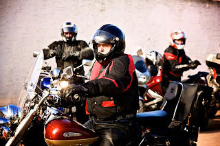
Overall I'm not keen on this image. I don't think it tells enough of a story, nor is it technically competent enough to be called a 'good' image, although I choose it because it depicted something to me which I find intriguing. Where ever you find a hobby, a past time or an interest, you always find a gang or tribe who want to share their interest/hobby/knowledge.
I can only imagine it calls on our human nature to be part of something bigger, or safety in numbers perhaps; but these men aren't stereo typical speed demon bikers, they were middle aged grandfathers who all had quite a bit on money tied up in their machines - coming together for no other reason other than a shared interest in motorbikes.
If the subject would have looked into the lens, and if I'd have been positioned so the background riders were to either edge of the frame, it may have made a better image.

I wish I could have spent more time, to achieve better results with this image, but overall I think it's a good interpretation of the setting.
I called in to a working mill on spec, and was delighted when my request to have a look around was granted. I hadn't planned it and had limited equipment (no tripod and only 1 lens!)
I had visited primarily for the places brief, and to attempt some 'urban exploration' without breaking and entering, but whilst I was there I was quickly guided round the working floors where these machines were mostly on some kind of automatic unmanned mode.
As I approached the end of the mill floor, there was this man working on the saw blades and a few sparks emerged.
The floor was dark, with dappled light coming through half painted, dirty windows, as well as the overhead lighting from the machines. As a result, quite a lot of the images are blurry or too dark.
The vignette may appear a little heavy, but a lot of that is actually the room itself, so the vignette was used to even up the darkness of the outer edges.

In this image, there is no face to communicate an expression or emotion. I quite like images like these, and may explore an environmental body parts theme for my final selection.
There wasn't much contrast to the image, as the sand and jumper were of a similar tone and the only stand out colour was the pink lead, so I choose to de-saturate the image, although not entirely.
I like that the situation is still easily read, even though a shallow depth of field has been used.
Because the immediate environment is required as part of the image, there was no need to zoom right in, and I still required an element of distance between me and the subject, so these were taken using a 17-70mm lens that stopped down to F2.8, meaning I could shoot in low light conditions, create a blurred background and selectively focus on chosen aspects.
Other Environmental images I have captured

Whist there location is not easily visible, by their clothing, you can easily tell that these men are on a stag weekend away. I found the line up a bit comical, and the colours really struck me.

A family at a classic car show enjoying a picnic outside their classic Citroen camper van, they were not exhibiting - just soaking up the days events.


Classic car owners at a car show
______________________
Fine Art
See main submission
______________________
Window light
Whilst this isn't a specific genre to explore, I have done a couple of images where the subject is unaware of the camera and lit by natural window light.
I like situations like these because there is something about the time to stop and ponder through a window.


In these two images I have chosen to use a black and white conversion with a high contrast, this seemed to suit the texture of the skin and the contrasting available light.
Studio Portraits
Today in the studio, I had the opportunity to practice some lighting techniques.
The set task was to use top, side 45/45 and backlight as well as to experiment with different angles, techniques and compositions.
Here are some of the studio shots;
Top light with natural light through the skylight

45/45 with a flash head and reflector & side light with soft box

Back light

The ability to practice lighting techniques was really useful, and allowed us to practice different angles and mixed lighting as well. In terms of creativity, I'm not very good on the spot, and find my ideas take a while to develop using books and the internet for inspiration - so I don't think I created anything outstanding - although I did want to try and create an image using small amounts of directed light; luckily I do have a few thinks in my camera bag that are a bit unusual and they came in very handy to create these images - which I think are my best of the day.


Inspired by this image of Jeff Goldblum shot by Jeff Dunas, seen in Lighting for portrait photography by Steve Bavister (RotoVision Books)

In this image a blue gel was used in front of the camera and the light had a compensating orange filter placed over it. In my shot, I was less concerned about the colours but did use a gel to create a coloured background.
I found this article on Pixiq.com - and found it interesting in terms of relating to the above pictures. There are endless number of 'set ups' but there will always be a couple of ways to get similar results.
April 14, 2011 @ 2:00PM
Lighting Essentials
Re-creating Lighting Set-ups

Throughout my career I've been asked over and over to re-create lighting situations from images in my portfolio or website. Knowing how to use light is one of the keys to success in photograhy. Weather you shoot on location or in studio, being able to create and re-create a look is essential.
All the images shown here have led to clients asking me to re-create the same or similar look for them. I believe one of the key elements in creating great photography is lighting. Once you have a keen grasp on light and how it works you can achieve any look you want over and over. To really understand light you must practice and experiment. Never let yourself fall into the habit of lighitng every image the same way or your images may start to look old. There are always exceptions to every rule. Richard Avedon and Irving Penn had incredble careers shooting a certain way but they always push the envelope to create stunning images. Irving Penn had a big influence on me as a photographer. As an assistant I worked for Neal Barr, who worked for Irving Penn. Much of what I know about light has come directly from the Irving Penn approach to lighting.
Today, try something new. You only grow when you do something you're afraid or apprehensive to try. It's not advisable to experience on a job but you should take time to push the boundaries. Play with mirrors, and reflectors in ways that you've never tried before. If you always use an umbrella try using a bare-head. If you always use a hard light, like the magnum reflector, try using a soft light or bouncing the light in different ways. Three of the four images here were created using a hand held mirror and having the main light BEHIND the subject. I discovered this approach by experimenting with light. You will always grow from these types of experiments and your photography will continue to thrive.
Matthew Jordan Smith
website: www.MatthewJordanSmith.com
Instructional videos: www.Gallery.MatthewJordanSmith.com
_____________________
The effect of lighting on physiology
Different lighting can alter the way the subject appears, or exaggerate features, sometimes this is what you want to achieve and other times it is less than flattering.
I have been reading several online articles and books to help me fully understand the effect of lighting on physiology.
________________________________________________________
Portrait Photography: Secrets of Posing & Lighting
Article taken from www.pixiq.com
_______________________________________________________________
_______________________________________________________________
Narrow and broad lighting are probably the two terms that are the most confusing for portrait photographers, but they are two powerful techniques that you must learn and understand. They are both based on 45° lighting.
Narrow Lighting- In narrow lighting, as you might expect, only a relatively small area of the face is highlighted.
With the 45° lighting set-up in place, ask your model to turn or tilt his or her head toward the shoulder nearest the key light, so that it illuminates the area from the ear (if it is visible) to the tip of the nose on the side of the face furthest from the camera. Although more of the shadowed side of the face is visible, the highlighted side now occupies a relatively small area of the picture.
Because only a relatively small area is highlighted, narrow lighting instantly makes the subject look thinner. If the face is turned too far, however, the key light will start to light the shadow side of the face and the effect will be lost.
This technique should not be confused with split lighting.

Narrow lighting - Narrow lighting puts most of the face in shadow but brings attention to the five planes of the face—the forehead, nose, chin, and the two cheeks.
Broad Lighting - In broad lighting, the head is turned slightly away from the key light. The highlighted area now appears wider than the shadowed side and, because the eye is instantly drawn to the highlighted flesh, the face seems wider and fatter. This is exaggerated in a low-key style of portrait, as the highlighted skin stands out even more against a dark background.
Broad lighting can be used to give power and strength to a portrait and is generally used in male portraiture to exaggerate the subject’s masculine qualities. Be careful not to turn the face too far, as this will make the ear dominate the portrait, even when it is in shadow.
Broad lighting should not be confused with flat lighting, but both techniques give the appearance of weight gain.

Broad lighting - Broad lighting highlights and accentuates the broadest side of the face visible to camera.
Tilting the Head
The shot on the left demonstrates the use of narrow lighting. In the shot on the right a shift in pose, with no adjustment to the lighting, accidentally produced a broad-lit image. As you can see, the narrow-lit image is far more appealing to the eye.

Narrow Lighting

Accidental broad lighting
Tips: Narrow lighting is great for women and for reducing overall body size.
Always shoot women from above bust height to exaggerate the eyes and make the neck look longer.
For a more dramatic image, turn off the fill light.


Exaggerating the effect - These two examples exaggerate the effect of broad and narrow lighting because only one light is used in each case. The lack of shadow detail makes it easier to see the effect; a simple trick is always to squint when observing the light on a subject’s face.
_____________________________________________
The Classical Portrait Lighting Setup

By comparing this illustration to the photograph, you can see how each of the three lights were positioned for this portrait. For more clarification, turn the page to see a pulled back shot showing the entire set.
The Main Light
As the name implies, this is the primary light source illuminating the subject. Usually it is a broad source, set at a 45°–60° angle from the lens axis that lights the short side of the subject’s face, thus creating a triangular highlight on the broad side of the subject’s face.
The Fill Light
This light lessens the shadows caused by the main light, and its intensity in relation to the main light determines how deep or open the shadow side of the face appears. The fill can be a second light source (usually another broad source), or a reflector of some sort, but these are usually positioned differently from each other because of how they work. If the fill light is another light source of equal power, it is should always be farther away from the subject than the main light and usually positioned close to the lens axis, but on the opposite side of the lens axis from the main light. It is always farther from the subject than the main light so that its effect is reduced. Both its distance and position are chosen so that the fill light doesn’t create a distracting second set of shadows on the subject’s face. If a reflector is used for the fill, and it is placed an equal or greater distance from the subject than the main light, then it is always less powerful than the main light. A reflector is usually positioned opposite the main light, as opposed to closer to the lens axis, because that position allows it to more efficiently catch and reflect the main light’s beam back toward the subject.

Sometimes you should forget the fill light altogether!
The Hair Light
The hair light has two assignments: It illuminates the subject’s hair, making it sparkle, and it separates the subject from the background. It is usually fitted with a light modifier that limits the width of its beam so as not to create lens flare. A hair light is usually mounted on a boom arm so it can be centered over and behind the subject’s head, or it can be placed behind the background, peaking over so its support stand is hidden. It is usually 1/2 to 1-1/2 stops more powerful than the main light depending upon the subject’s hair color.
The Background Light
As the name implies, this light illuminates the background but, unlike the other three light sources, it has the least consistency in how it is used. It can be placed high and to the side of the background with a light modifier narrowing its beam so that it slices across the background. It can be fitted with a light modifier to narrow its beam and be placed low and centered or off to a side to illuminate the lower half of the background. It can even be a broad source depending upon the background’s size, or it may even be two or more lights combining broad and hard sources to illuminate the background and spotlight details within it. Background lights are usually 1/2 to 1-1/2 stops less powerful than the main light, depending upon the background’s color and how you want it to appear.

Note how often “usually” is used in the descriptions of the four light sources. While I can guarantee that using the suggestions cited will almost always produce a stopper portrait, there are literally millions of other ways to create beautiful portraits—but you should at least understand and try these suggestions. Also note that “always” is rarely mentioned above. These absolutes are etched in stone because they refer to the definitions of what the lights do. If you are working with two lights of equal power, and move the fill light in closer than the main light so that it becomes more powerful, it is no longer the fill light because it has, by definition, become the main light. If you were to do this, then the main light automatically becomes the fill light. The point here is that by mentally assigning each light a title, and understanding the definition of that title, it is easier to understand how to position them.
The techniques described here don’t always have to be followed to the letter. Photography is a creative pursuit, and bending and breaking the rules is one of the best ways to get exciting new photographs. But you’ve got to start here, building your simple house, before you can tear it down and start over on your masterpiece. Also, there will be days when you’ll find yourself shooting a portrait while you are juiced up on a cold medication and you’re blurry eyed from a 102° fever. When one of these days happens (and if you become a pro, it will happen), you can wrap yourself in the warm blanket of basic technique and experience and still get the assignment done.

For this photo, I didn’t bother to use a background light because the muslin I used (an Adorama Belle Drape) had a painted-on hot spot.
_______________________________

Lighting Ratio's
Whilst this article isn't ideal, it does help to serve as a reminder when considering lighting ratio's.
Adding contrast to an image can add to the overall mood, and differentiate your images from everybody else's - giving you a unique style.
This is the effect different lighting ratio's can have on the overall image - and on a persons individual features (this is great for defined faces, but maybe not so good for a fuller face)

Images taken by Elliot Boyd in a session instructed by Andrew Farrington
I do like the overall effect, and can clearly see the advantages of using varying ratio's to gain the required effect.
I'd like to try this with coloured gels and throw something else into the mix;
- maybe a colour over the camera lens and a neutralising gel directed on the face alone
- coloured gels just on the two lights which were side& behind
I think this may add a further interest to the shots?
____________________________
Corporate Portraits
Corporate Images are any image where the photographer has a set task/brief and the photo's will be used by the client for their own corporate use.
For example, advertising imagery is just as much corporate as corporate 'mug shots' used on web sites, business cards and press releases.
Some corporate portraits are intended to be lacking in the subjects personality as the client may wish to give the overall appearance of importance, seriousness and appear professional - depending on what line of work they are in.
Companies are now starting to use images in different ways, and are more aware of the power an interesting i mage may hold - so some creativity can be seen is some 'open minded' corporations.
And when you consider that celebrities are also part of a corporate enterprise - and then look at their imagery - you can see a lot more creativity.

Traditional style image from London Headshot

Alternative setting for Corporate portrait from Feature Shoots

Creative portrait from altiusdirectory.com
Obviously much will depend on the brief given to the photographer and the end usage intended for the imagery.
We were able to carry out a corporate photo shoot for some of the staff at Blackburn College. The brief was a little vague, but the portraits had to be uniform in appearance and monotone.
Here are the notes from the day - collated, as individuals attended varying sections of the day.
Write up from today's session - setting up etc, lights were moved around quite a bit whilst we were waiting for models so I'll keep it bullet pointed for ease of reading!
- Large soft box was initially suggested as main light source - but was dismissed as too big
- Snoot would be to small/directed
- Front 45 degree flash head with grid/honeycomb modifier attached (sorry haven't noted outputs) on a tripod well above head height angled down and 45 degrees was agreed as main light source
- A second flash head was placed directly behind subject with the background modifier on it (the elliptical shaped one) on a stand
- A poly board was placed to the side of the subject, also slightly angled (front of the board further towards the subjects shoulder) with the black side to the subject
- Adam has drawn a floor plan for Flickr
- Meter subject and take a test shot - background is dull/grey - meter background - two stops difference between readings - so turn light/power up on background light to compensate and produce a white backdrop.
- Shots were to be Monochrome, JPEG & RAW, camera settings were 1/125, ISO 100 F8
- Because we have metered the light , if we keep the distance in between the subject and the light the same, it can be moved to create differing effects
- A tape line of 4 feet was marked out from the original 45 degree position to directly in front of the subject - tests shots taken and no change in exposure was required.
- By getting the subject to move their head in front of the modelling light, you can see changes in the way the shadows pick up on features, flatter the subject or cause an unwanted shadow - this can help you tweak and position the lights to get the best angle.
- Men, in general, look better with the main (front) light at the original side/45 degree position and shot from straight on (with slight angling on chin etc), whilst women (in general) looked better with the main (front) light directly in front of them with the light being raised to well above head height and shot from above using the step ladders (the boom could have been used to have both set ups ready)
- Lighting women in this way is a way of avoiding double chins!
- The backlight can be used to create effects also - in most instances the light was positioned so that the arch that the light created was just above the in-camera head height of the subject - creating a vignette when the image is cropped
- When the backlight is angled further to one side of the subject, a dark background would be behind the lighter side of the face and the darker side of the face would have a whiter background adding further contrast - though the position needs to be adjusted for each subject (in both cases)
- As multiple people were taking images and subject might have limited time, all the remote triggers were used to minimise time swapping over equipment
- Not all subjects would be comfortable having images taken anyway, add to that being surrounded by a group of students; so it was important for us to appear professional and in control of what we were doing. The subjects were aware that we learning during the shoot, and checking lights etc, but we still needed to be as professional as possible - and listen to instructions - but keep shooting.
- Building a rapport with subjects can help them relax, and directing them as to where we wanted them to sit/face/look tilt in a clear manner would have put them more at ease and speeded up the process
- Some people are more sensitive to light than others, in these cases subjects can close their eyes in between shots and open on the count of three to avoid blinks and closed Iris/pupils
- In the same way it's important to let you subject know when your shooting so that they can get the 'pose' right for you and maintain it as long as you need and not slouch/relax mid 'click'
- Likewise, some people have issues with certain features, that we need to work with/around - I don't want to show teeth/have glasses on/make my skin look nice etc - we need subjects to trust that we will get them looking at their best whilst still fitting in with the task/brief specifics.
- Showing the images can help do this - hence shooting in RAW and JPEG
- 'Keep talking, make them comfortable, look through the lens and check frame and lighting position and let them know when your going to capture'.
Here are the set up shots

Here are the corporate images unedited

Overall I'm not happy with the standard of image I obtained. I think this is down to a number of things
- Not properly understanding the requirement of the images - to look the same
- Subjects being uncomfortable with large groups observing
- Me being uncomfortable with large numbers observing
- Time constraints
- Technical issues - the hot shoe didn't fire the remote release a couple of times and completely threw me.
Here are my edited shots

I like this image, but know the subject didn't want her glasses on -
so not one I would put forward.

Another that I wouldn't put forward, although I like the eye contact and the overall pose, the backlight did not fire. Whist as a stand alone image, it has it's merits - it win't match the rest of the images taken.

I think the angle woks well here for this gentleman, but the pass left around the neck and the glare from the glasses are disappointing.
Here are some more traditional head shots from a 2nd commercial shoot


_________________________________
Research images for main portfolio submission


I like the way these images use body parts are small sections of a face to convey something - rather than head and shoulders.
I also really like the soft tone-ality of the grey scale images.


I think these are quite strong portraits in terms of expression and the viewers 'readability' of the image.


Cindy Sherman produced images that were staged, and portrayed female stereotypes - they have a very cinematic feel and played with the politics of a woman's role in society. I appreciate the images - but I don't think a staged scene would work for my 'I am' theme, as these people are telling us about who they feel they really are, and what makes them- them. If it was staged I don't the think the emotion would be there. That said, I don't intend to show faces - so is real emotion required for the image, or for me?

Should I try nude? Is it required for the i mage I want?
Does it add to the overall communication/aesthetic?
______________________________
Ideas for main portfolio submissions
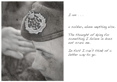
Whilst I am unsure wether I will be able to get the people and locations right for my final submission images, I am thinking of doing a series based on the quote ' I think therefore I am?'
For more information on the Descartes philosophy please click here
In preparation, I have been thinking and asking people around me to sum up themselves and what they stand for by completing the sentence - I am . . . . . . .
I think, therefore I am . . I am what? . . .who am I really??
- A mum first and foremost
- A dancer, but age and ill health got the better of me
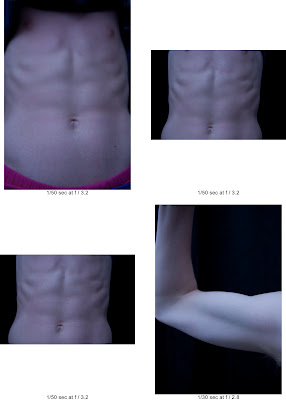
- ripped, what else is there? (as in muscles)
- always learning new things
- a soldier in the making
- old, old and worn out but everything still works!
- too many things to mention
- an over sensitive thinker
- lazy
- a musician and lyrical poet
- drowning in the prospect of living this life
- dependant on anything and everything
- a drifter
I have expanded on these comments from my knowledge of the people concerned and visualised some images that would communicate their statements - although I realise they do not need to be too literal as the comment will be placed at the side of the image.
As the images will be taken at different times of day, in different settings, I think it will be best suited to have a common theme or technique. This may be the focus or the crop, or the colours - at present I am thinking about a muted palette or greyscale but it's still a work in progress.
Test shots
And ideas on visuals
I have taken some test shots and while converting the images to monochrome and adding some shadow and highlight detail using Niks Silver Effex - the images didn't seem to gel and work together - as I'd guessed, the fact that they were all taken in varying lighting conditions had given them all a very different feel.
In order to try and rectify/minimise this - I've decided to use a texture layer in Photoshop.
Here are the test contact sheets from my test/thought shots
Dependant


As I want to use a texture in a layer, I have to be honest about my ability my CS5 skills are limited - so online tutorials are being utilised and my first attempt isn't looking too bad.
Layer used from a free source.

Selection of base images
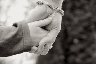


Image with Texture added

Final Images


Self Evaluation
I've printed my images and I am still interested in the concept of mixing quotes/thoughts/text and images, but if I were to criticise the set I would say ;
As the images will be taken at different times of day, in different settings, I think it will be best suited to have a common theme or technique. This may be the focus or the crop, or the colours - at present I am thinking about a muted palette or greyscale but it's still a work in progress.
Test shots
And ideas on visuals
I have taken some test shots and while converting the images to monochrome and adding some shadow and highlight detail using Niks Silver Effex - the images didn't seem to gel and work together - as I'd guessed, the fact that they were all taken in varying lighting conditions had given them all a very different feel.
In order to try and rectify/minimise this - I've decided to use a texture layer in Photoshop.
Here are the test contact sheets from my test/thought shots
Dependant

Always learning

Drowning

At the start of my journey

Lazy

Mother

Musician

Gun/Uniform/Suicide

Time passing

Vain/Strong

Drifter/loner

As I want to use a texture in a layer, I have to be honest about my ability my CS5 skills are limited - so online tutorials are being utilised and my first attempt isn't looking too bad.
Layer used from a free source.

I choose this texture (called slate) because of it neutral feel and look, and when opacity is low, the tones blend well with my edited images.
Selection of base images


Images converted to black and white within Lightroom 3 then exported to Silver FX and edited to add more definition to highlights and shadows.
Set ups were significantly different for each capture (single directed light, natural light etc)
Image with Texture added

The texture was layered over the base image and it's fill and opacity set to even out the background. It was then 'rubbed out' at various strengths over the main subject
The image was then placed on a white canvas in photoshop and then text added.
Final Images


I've printed my images and I am still interested in the concept of mixing quotes/thoughts/text and images, but if I were to criticise the set I would say ;
- I need to perfect use of textures/layers in photoshop
- consider the effect of layers on colour - should i have converted to black and white after the texture was added to get a more consistent tone?
- I need to ensure I know what format/size the end piece will be and take shots accordingly (i.e. all the images are different sizes in the set because of crops and aspect ratio's)
- Choose similar depths of background/similar light on skin tones - the texture doesn't even it out enough
- I could afford to be more creative and abstract in the illustration as the quote fills in any gaps - too predictable and safe.
- Not sure if this really is fine art, there is more going on that just the aesthetics. They are not really images you'd want on your wall!
_____________________