The Assignment
ob·ject –noun
'anything that is visible or tangible and is relatively stable in form.'
___________________________________________
Brief details
This unit is intended to provide diverse opportunities to learn fundamental photographic techniques associated with image production within a controlled environment.
The term 'objects' is used in order to encompass not only photographing inanimate forms but also 'still life', close up work and commercial products. These may include 'pack shots', product photography, photographing three-dimensional artwork and recording natural forms. Opportunities will be provided for the design and construction of 'sets' suitable for photographing more complex scenes.
Substantial emphasis will be placed upon lighting theories and techniques, digital asset management and digital manipulation.
Learning Outcomes
- Understanding fundamental theories of light, lighting and image capture.
- Demonstrate an awareness of camera formats including digital and relevant film based systems.
- Design and construct basic 'sets', working both independently and as a member of a team.
- Create darkroom and digital images using fundamental imaging processes and image storage techniques.
- Adhere to health and safety practice and regulation guidelines
- Demonstrate an awareness of the utilisation of object based photography
- Close up and Macro
- Mini set build
- Commercial product
- Highly reflective subjects (such as glass, chrome etc)
- Historical objects and their narrative (with Blackburn museum)
You must accompany each photograph in the portfolio with a written evaluation of the work involved in it's production (research - design - treatment - post production). Each evaluation should be no more than 150 words.
Portfolio size should be A4 minimum with images produced on suitable print media. Accompanying evaluations should be placed behind its relevant photograph.
Assessment Criteria
- Investigate research within controlled lighting environments, with recorded evidence of technical and creative findings.
- Detail and accuracy of descriptions and evaluations for portfolio images.
- Ability to work both independently and in a team, to produce effective and appropriate photographs.
- Understanding of key areas/genres of 'object' photography.
- Attendance in appointed tutorials and lectures appropriate to the objects assignment.
-------------------
The purpose of this page
I will use this page to document and evidence the work carried out during the course of this assignment brief, and to explore the technical processes, design and conceptual ideas leading up to the production of my final images.
I will also use it record my thoughts and learning experiences that don't fit into the scope of the 150 word evaluation document.
I aim to demonstrate a good standard of studio work, showing clear evidence of creative ideas as well as record my thought processes behind the photographic style used and what has inspired and influenced my end images.
--------------------
In Preparation
Before taking any images, or even thinking about what 'objects' I would like to photograph, why and what I would like my images to communicate, I must consider how I am going to approach the assignment from an organisational point of view, so I can reference, view and work on images quickly and easily.
Asset handling and management
During the course of completing this assignment, it's safe to assume that I will take, manipulate and print many pictures. Some will be used to demonstrate techniques and ideas, some may be discarded, and some will be used in the final stages of post production and selection for the end portfolio. As such it's important to store, collate and categorize these images effectively to save time and/or loss and damage of images.
Most of my work will initially be digital, as I use a digital SLR camera as my main source of recording. As such it is important to have some kind of digital back up, as technical issues can affect the integrity of digital files, and at worst a technical failure can cause complete loss of data.
In order to avoid any kind of corruption of loss, I use the following methods;
SD cards - multiple cards of 'small' capacity are used during shoots.
I have taken this decision for a number of reasons. The SD card is the first component used in recording images. My camera does not have the capacity to use two SD cards at the same time to have a duplicate 'back up', nor do I have the capacity to wireless-ly send pictures directly from the camera/SD card direct to a PC at the time of shooting. With this in mind, my shots are vulnerable should an SD card have a malfunction, as at that point they are the only copy of work. As a novice, simple shoots with lighting set ups, or even out on location, can take some time, with 100's of shots being taken for experimental and learning purposes. If I use several 'small' capacity cards (4GB) during the course of a shoot, and a card malfunctions, then only a small percentage of work will have been lost, as opposed to a full set of images if I were to use a single 'large' capacity SD card (10MB).
I also ensure that at the end of each day/shoot/set all the cards are cleared as appropriate to ensure sessions don't get mixed up, or left in the vulnerable position of not being backed up/duplicated.
External hard drives
My laptop has a relatively large dual core physical memory system, which totals 250GB, one might assume that this is large enough to collect the images from an SD card, however, as with all technical equipment, malfunction can occur which results in corruption and/or loss of data. I therefore use two external hard drives to duplicate the contents of my laptops hard drive. The files include not only images, but also course notes, thought processes and word documents which contain the wording of website/blog entries.
One drive is a 500GB portable hard drive which is small enough to be carried around at all times (enabling me to save things from multiple computers and sources), and a 1TB powered hard drive which remains in situ at home and includes surge (power) protection and a monetary guarantee from the manufacturer (however, that would be insignificant if treasured memories or important work was lost!)
I also password protect my external hard drives to add further protection should anyone wish to access files without permission.
Online storage
Even with my current laptop, and external hard drives, physical equipment is still susceptible to technical failure, so with that in mind I have opted to further back up my work by utilizing an online server. Online servers back up selected data files and make an electronic copy on an off site server. Data is further secured by using various encryption processes as well as being user password protected. Files can be accessed from any PC with an Internet connection, and this can be used to sync various devices, and also to share work for collaboration purposes.
After some research, considering reputation of company, encryption standards and price of ongoing storage, I have chosen to utilise free data allowances with Microsoft SkyDrive and Virgin Media V stuff for personal and family data, and use a paid service by Dropbox for course work.
Physical storage of printed/physical media
Printed images by their very nature, can easily be damaged by graceless handling. Printed images should be handled with care, wearing gloves where required and employing a gentle 'grip' trying to utilise the 'edge' as much as possible to avoid any contamination of the print itself.
The conditions in which printed/physical media is stored can affect its condition and lifespan, as they can be altered/damaged by humidity, light, ph and temperature. In order to preserve for as long as possible media must be stored in a cool dark area in an area that will retain a moderate humidity. The paper on which the image is printed and the ink can also effect the lifespan of the print and there are industry articles and tests by which one can make informed choices but no industry standard. Papers, storage boxes and plastic envelopes can all be purchased to store and catalogue physical media, but quality varies. There are some national and international quality standards that storage materials can conform to, these offer the best possible variables to safely store items.
ISO 18902, provides specific guidelines on albums, framing, and storage materials as well as requirements for photo-safety and a specific pH range for acid-free materials, it also excludes the usage of harmful materials including PVC and Cellulose nitrate.
Digital data organisation
Organisation is a very personal practice, and each person will develop their own preferred method of cataloguing, naming, and tagging their own collection of work. I consider myself a very organised person and like to keep the same method of naming and file paths throughout all my systems. I keep the camera generated name on all my images, but rename the folder dependant on it's use, subject and date, For example work for this unit will be placed in a folder named Unit 4 Objects and would have a file path of Device name/Pictures/Uni Work/Unit 4 Objects/Macro/Brush/Test Shots/DMC_00125.
(Objects is the name of the unit, Macro is the area of exploration, Brush is the chosen subject pictured, Test shots are ideas and prep work and not yet manipulated, followed by the image name. I might also have a post production and Final folder with the Brush folder)
These file paths are recreated on the back up drives and the catalogues within Lightroom, to create a consistency and to help aid quick retrieval.
Lightroom is a computer programme which is part of the Adobe range, it is used to view thumbnails and rate them using colours and/or star systems, perform non destructive editing which can then be carried out in Photoshop, as well as organise print jobs, create contact sheets and publish to the web. I particularly like and use the colour identification system to easily and quickly identify images I like, and would consider for post-production and/or print, as well as the ease in which I can produce contact sheets with EXIF data.
Health and Safety
As well as the University policy on Health and Safety, First Aid, and Evacuation procedures (documented on P15 of the course handbook) particular care must be taken regarding safety procedures that relate specifically to the photographic department.
Whilst these may seem to most like common sense, a regular review of activity and safety considerations must be carried out. Things to consider may include;
- Proper usage/storage of chemicals
- Proper usage of electrical equipment including consideration of wire location and method of securing
- Proper handling of equipment including consideration of material (glass lamps) and potential temperature (halogen units)
- Proper usage of ladders
If in doubt at any time, guidance and assistance should be sought before engagement in any activity.
--------------------
Objects
Macro and close up
The true definition of 'Macro' in terms of photography is when the image captured is life size in relation to the size of the film/sensor, so has a ratio of 1:1. The use of the word more commonly relates to any close up work, and with technical advances in lens manufacture macro lenses can magnify as well which means ratio's of 5:1 are achievable.
Uses
Macro photography has many uses, it can be used to reference and illustrate for technical and scientific purposes, for many years marco shots of flowers and natural forms have been used as decorative pieces in the home or in offices and in some cases are classed as fine art pieces, macro photography is used in food photography and also to illustrate web pages and online shopping sites.

Image from fabiovisentin.com

Image from physorg.com
Choice of item
Through research for this project, and my overall interest in the subject matter, I'm drawn and inspired by the work of Imogen Cunningham, particularly her use of strong light to accentuate structural forms within flowers.
I wanted to use this opportunity to photograph objects I would not usually consider, in my practice and preparation shots, I am however, still drawn to texture and structure and would like to use Cunningham as inspiration in my final piece.
I am lucky enough to have easy access to many different plants, one of my favourites is a Heuchera named 'Chocolate Ruffles' usually picked for its dark green and purple foliage, but equally interesting for its structure.
Here are some examples of Cunningham’s images of natural forms. The composition and light both help draw the attention to the structure.


(More examples of Imogen Cunningham's work, including her images of Lilies, can be viewed here )
In preparation, and just for test shots and practice with a Macro Lens (for more information and learning outcomes from the session please see Systems and Processes) I took photos of a make up brush.
Whilst this is just for test shots, self manipulation and presentation of self is a theme I may pick up on later in the project using other objects.
The brush itself is made up of different materials, has a nice reflective band on it, neutral colours and interesting texture around the bristles, but not particularly well constructed or high end. I thought this would make a worthy object to explore in the test shots, and I'm interested in creating an image with striking shadows but texture on the head of the bristles.
In order to try and explore texture, I have also photographed various objects that possess different depths of texture with different lighting techniques; this will help me create the right look and feel for my final image.
Test shots and use of macro lens
In the studio, we were able to use a macro lens to understand the principle of 1:1 ratio and capture images using various lighting set ups including the use of a light table which allows light to pass through the acrylic sheet on which an object is placed. Whilst it is unlikely I will use any of these shots as a final piece, I have had the opportunity to use a very large aperture (creating a very shallow depth of field), and experiment on how light captures, emphasising or flattens texture.


As you can see in this test shot, the main lighting is coming in from the left side and positioned slightly above the object, adding to the texture of the bristles and make up powder. The acrylic table allows a reflection to be formed, but the fill light coupled with the light underneath the table allows no shadows to form.
Taken on Nikon D60
ISO 200
F 4.5
1/60sec
In the next image, the depth of field is too shallow. Whilst there is texture on the tip of the brush, the front bristles are out of focus and flattened. The reflection is still present, however the shadow created is not sharp and crisp, as the light was softened with a soft box.
Keeping in mind the Imogen Cunningham images, the light used in my final shots will need to be more directional to create a strong shadow, but not too strong as to flatten the texture of the chosen object. I will also prefer to work with a black or white background, and if using white, will need to use background lights to avoid the 'grey' backgrounds that can emerge from unlit backdrops.
In the next experimental images, a cabbage has been used, with lights moved around the leaves to see the effect it has on texture. When the light hits the leaves 'dead' on, the leaf is flattened almost, where as when the light 'skims' the surface the texture is captured and even exaggerated. Note also the effect on colour as the light is moved closer to the leaves.

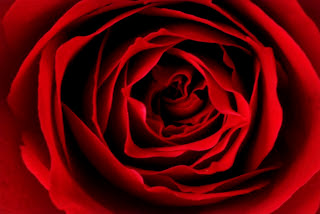
Final Image
Taking into consideration everything I've learned from my test shots and experimentation, I have decided to use quite a strong light to create a strong, but not a harsh shadow. The direction of the light is important, as I do not wish to flatten the chosen object, but neither do I wish to exaggerate the natural textures. So a light positioned close to the subject but slightly to the right side feels like the right set up.
In consideration to the composition, and the style of my inspiration images, I want the shadow to be behind the object rather than on the surface on which it is placed, so again careful positioning of the light source, the camera and the object is required.
The chosen object is a stem from a Heuchera plant, chosen for its form and structure.
I took several images to obtain the right composition and these are some of the shots.

I chose this image in particular as the subject matter and the shadow fill the frame, there are no 'cut offs' that make the viewer feel like they are missing something. The shadow is strong but not over bearing. The viewer is invited to view the whole frame as there is more than one focal point (the stem and the shadow), the stem is vertical and the dark on the left combined with the light on the left gives the image a sense of balance.
The following images show it in its various stages of completion.

As taken, against a white wall in low light conditions, with a directional desk lamp positioned to the left. A high ISO was used for 2 reasons, the low light conditions and to achieve a level of noise/grain. ISO 800, 1/100, f/9 + 0.7 exposure compensation, 34mm.  Image cropped to eliminate any distracting unwanted elements such as the pattern of the wall paper in the background. White balance corrections carried out in Lightroom to correct colour cast from halogen light source.  Image edited in CS5 to create a black and white image with a 'maximum white' preset to enhance the contrast. ------------------------ |
Macro and natural form
As an extension of the macro work done in the studio and my own interest in flowers and close up photography, I borrowed some extension tubes from the college store.
Extension tubes have no lens or glass in them, and are simply a tube placed between the camera and a normal lens. By moving the lens away from the sensor it allows closer focusing and greater magnification. The amount of magnification can be calculated by dividing the focal length of the lens by the size of the extension tube (so a 50mm lens with a 32mm extension tube would give a magnification of 1.56).
Extension tubes can be supplied with or without contacts, this will determine whether the camera's auto focus, in camera metering and exposure setting will function or not. In this case the extension tubes did have contacts, but because of the nature of the object it was necessary to use manual focus and a light meter.
I wanted a very close image, but still sharp in the centre of the bud, I also wanted to focus the light towards the centre of the bud too, which was difficult to place as I would be so close to the subject. In the end the set up which seemed to work best was a light to the front/left, and a light to the centre/above the subject as in these position I would not interrupt the light or cause a shadow.
The image reminds me of image I've seen as ready made wall hangings, but could easily be used in craft/cards, website logos, packaging on beauty products, the photograph is quite versatile.

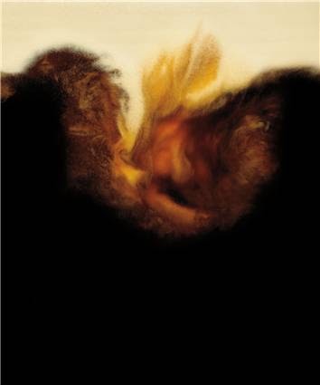
Taken with reverse lens

Original un-edited image of miniature orange rose
ISO 100, f10, 1/2sec, 50mm lens + 32mm ext tube.

Edited in lightroom for white balance adjustments and photoshop CS5 to 'blur' the outer edges drawing the viewer in to the centre of the flower.

Image converted to black and white.
I like the edited versions, as I do feel like they add to the mood of the image, and drawing further focus to the centre of the delicate flower. The lighting was quite flat as I didn't want any harsh shadows to detract from the delicate petals, and the blur to the outer edges has added to the delicate feel overall.
There is no background in shot - so no distracting background 'noise' and even in low light ISO 100 has still been used to ensure the centre of the image is crisp.
Whilst monotone (even in colour it is still within the spectrum of one colour), the full tonal range of that colour is in use in the highlights and shadows, so even though the lighting was flat, the image still has depth.
The inspiration for close up rose centres came initialy came from the Ernst Haas imafe for the book 'Creation', although I did want the overall image to appear 'softer'.
Final Images printed and added to portfolio


The inspiration for close up rose centres came initialy came from the Ernst Haas imafe for the book 'Creation', although I did want the overall image to appear 'softer'.

Ernst Haas
Final Images printed and added to portfolio

---------------------
Set build
A set build is when a surrounding is artificially created in a studio, it could be as simple as finding authentic historical china tea cups to sit on a period table and lace table cloth, or it could be as complex as re-creating an entire room and/or building. The set will be everything the camera sees, either in the background or to house items which are the main focal point.
In this brief we had to work as a team to build a mini-set.
Preparation, ideas and inspiration
In a group of 3 we had an informal brain storming session, where we shared ideas on what we thought of a suitable set build, and our own ideas. As 3 very different individuals, our ideas and influences were very varied, and in order for everyone to be passionate and on board, we needed to find a common ground, so out discussions moved from our own individual ideas to films we'd seen, music we liked, themes we were interested in.
We discussed the film 'Butterfly effect' which explores the chaos theory and the effect changing one event would have on an individual’s life, both past and future as 2 team members had seen the film and the third was interested in the theory.
We sketched a few ideas for a 'desired outcome shot' but in order to convey the messages we wanted to convey, we decided we would need multiple different shots with different sets merged into one image and at this stage, maybe this was a little too complex.
Still on the idea of films and relating to earlier discussions about flipping the idea of a 'tea party' on its head we explored the theme of 'Alice in wonderland' and alternatives;
- Chav's tea party
- Druggies underground gathering
- The film Malice in Wonderland
- Homeless den
As we all agreed this was something we'd like to explore we chose this as our initial idea, as we could all get a shot and take something different from it.
My inspiration was the film 'Malice in Wonderland' which tells the tale of rich Alice who after an accident is transported into a surreal underground world of drugs, power, sex and violence which mimics some of the characters from the classic 'Alice in wonderland'

The front cover image used on the DVD case. |
We then made a list of unseen elements of the set, how we wanted to make it feel;
- Dark
- Underground
- Lit by street lighting, maybe red light district or neon’s
- Dirty
- Seedy
- Voyeuristic


Examples of the dark and red tones used throughout to add emphasis to the underground setting. These are snap shots from the film.
Here are some other images I used to research and inspiration

Image from california.rehab-center.com
Commercial image for website illustration

Untitled, Larry Clarke 1972
The film in very tongue in cheek with the events and setting being in stark contrast to the classic wonderland, however with its flashing disco lights it was important for me not to glamorize the set and I wanted it to remain quite dark in mood.
This would be a feast or wonderland to some inhabitants of the underground drugs scene however dark and seedy or indeed dirty it is.
Planning and organising
With ideas in mind to the theme and feel of the set, we then started to discuss what items we would need to have available and what we would need to create. At this point we were not sure/agreed on whether the shots would be close up or wide angle, and as we all wanted to achieve different images we covered all bases.
- Walls. 2 to allow for ease of movement within the room/basement, which meant we had to 'build' walls
- Wallpaper, clips to hang & backdrop stands to hang from
- Floor, dirty, painted concrete maybe? Used a camping groundsheet to create seamless grey floor
- Light source present in the room. A work light and a modifier on the boom to create the illusion of a 'pendant' light or bare bulb
- Table - old wood, dirty. A tea stained paste board and old reclaimed wooden side table were sourced
- Make shift seats. Use whatever 'would' have been available in the setting. We opted for beer barrels, crates and boxes
- Tea party 'goodies' - what would these people have if they were to sit down together? We used beer/vodka bottles, pills and pill bottles, a syringe & needle filled with cold black tea, a 'home-made' bag of drugs, car radios, a gun, bullets and a knife!
- 'Wonderland' symbols - a carriage clock, a wrist watch, a label on the pills 'for your head' and a deck of cards
Once we had a list, we ticked off items we already had, and distributed the others dependant on what each individual thought they could source/make.
We communicated throughout on email/social networking sites and little team meetings to ensure everything was on track, decided on a date and booked the studio.
On the day
On the day of the set build we had to ensure transportation was in order, for those carrying bulky items who would normally get public transport, which meant an early 5am start for some!
Once we had everything in the studio we set about putting the scene together;
- Floor first
- The 'walls', this was time consuming and we had the thing about where the camera and lights would be placed
- The background, an old side table with 'stolen' paraphernalia (radio's etc)
- The focal point, the tea party table with all the objects we'd chosen that would communicate the mood and setting of the scene
- Placement of items - we moved the items around during the shoot dependant on the angle of view for the viewer and the intended focal point
- Lighting, we used various set ups, but the model light above looked the most accurate for the scene, but in the images looked a little flat.


The set

Discussing what goes where

Best laid plans! One of the wallpaper walls falls down!
The shots
Once we had everything set up we had to get the lighting set up for each lighting requirement and take turns to get shots before moving any objects and changing the lighting. Doing it this way, quite methodically meant everyone had the opportunity to get shots at different angles and under differing lighting conditions.
For my shots, I used differing white balances to obtain the 'reddish' tone to the image, and opted for no flash.


The effect of different white balances in the same lighting conditions.

Experimenting with different colour casts.
We were also aware that the scene contained a large number of items, and could become quite distracting and busy, whilst we wanted the scene to appear crammed and manic, we didn't want to overpower the viewer, so most shots were of a portion of the table only, rather than the whole scene.

Through the keyhole idea

Collage idea
In hind sight, I don't think any of my images really fit the bill and create the mood I was setting out to create - the background looks too busy and distracting, and an aged/vintage look doesn't suit the film or the objects in it.
I have decided to tightly crop one of my images and play on the way the eye works to lead the viewer back into the image and to the intended focal point.
I have added an aged effect but reduced it's effect by making it transparent, this gives the impression of a spot light on the intended focal point as well as slightly mask all other colours apart from the Queen of Hearts.
Final Images


--------------------
Commercial photography
The definition of commercial photography is any image, which the photographer is paid to produce, or paid for, rather than a work of art. However, in today's terms, it usually relates to any image used in a commercial sense to sell a product/idea/campaign, even when the product IS the photograph.
In this sense, commercial photography can include;
Advertising/Packshots Fashion/Glamour Still life images
Food photography Editorial Portrait/Wedding
Here are some examples;

Marks and Spencer website - food photography

Product shot used in catalogue and shopping sites from Clarins.
For this portion of the objects brief I am going to use the skills acquired during the 'Reflective Objects - Bottles' exercise (see systems & processes) and revisit some perfume bottles.
A lot of commercial perfume photography include a well known top model or celebrity endorsement and images/shots of just the product are not uncommon, but aren't the industry norm. An image of the bottle is still required though, to overlay the image in post production as they all do still feature the product.
I am not highly skilled in Photoshop and at this stage would not be able to create this layered image to a level that I would be happy with.


Taking inspiration from the actual advertising campaign images as well as the pack shot of the bottle on the box itself, the bottles are used in isolation and layered post production into both the box layout and the advertising image - so there is no need to consider background other than the effect it will have on the actual bottles.

Advertising campaign for Kenzo Amour always included a small layered image of the 3 bottles
In the bottom right, as well as the Kenzo 'bird' in the top left.

Kenzo Amour packaging included a life size image of the
bottle within, showing which colour bottle the
consumer was purchasing.
Looking at the images it's also important to concentrate on the contours and colours of the bottles.
I used a product table and 3 lights
- one underneath the table to avoid dark shadows
- one to the right hand side at the front of the bottles to create the wide highlight that follows the contours of the bottle
- One the the left hand side and rear to create the narrow highlight on the outer edge of the bottles.
White balance was adjusted to ensure that the colours were vibrant and true to the subject.

The position of the bottles varies throughout the campaign, so I positioned mine to show the differing contours on each side of the bottles as well as depicting their varying heights.
In post production, I used light room to increase the saturation and vibrancy of the bottles.


Packshots
Whilst creating the above images I was interested in exploring Pack Images
A packshot is a still life image of a product, usually used in it’s packaging.
The picture usually depicts how the item looks inside, or how the manufacturer wants it to look in the eyes of the consumer (after cooking and/or preparing in the case of food pack shots)
Whilst this may not be viewed as a contemporary, important or artistic form of photograpghy, it is one that surrounds us in everyday life and subliminally influences our decisions.
I have decided to produce a pack shot as part of the objects brief and have used supermarket own brand products for research and inspiration.
From looking at supermarket own brands and more expensive brands, the packshot advertising usually encompasses one or more of the following features;
· Product in it’s prepared/cooked state on high end crockery in a romantically lit environment

· Images of one or more of the raw ingredients in their natural state

· Ingredients are often seen in a kitchen setting
· Or in other examples the ingredient is the only visible item covering the whole packet.

In all they look appetising/realistic.
I have desided to attempt the latter.
I used overhead lighting (multiple lights over the subject at regular intervals) to create an even lighting effect that retained it's natural look/feel.
I washed the tomatoes but left them in a damp state to ensure maximum shine.
I metered the subject and captured accordingly.
In post production I cropped the image to remove the bowl which was holding the product - however in a real life job situation the agency would specify the size required for the packaging (tin wrapper/carton etc) and the picture would be captured accordingly.
Final Commercial Image 1

Commercial Advertorial/Editorial
Editorial or advertorial images are usually created to invoke a feeling which either positively enforces a product (in the case of advertorial) or backs up or enforces comments in a column in the case of editorial.
As a pack shot can be seen as not exciting, I decided to create an image that would be suitable for editorial or advertorial use.
I captured a perfume bottle from above ensuring there were no distracting shadows or reflections - the shadow that is created is fairly transparent and draws the eye to the negative space that would be used to type.
In editing I increased the saturation and hues of the jewel like colours to fit in with the design of the bottle and the 'gems' that adorned the bottle neck (just seen)
Final commercial image 2

I have recently been looking at the Campaign website which is an awards programme for commercial and advertorial photography
.
Each of the images is entered under a title, and the range of images is quite remarkable.
This has given me some ideas to explore in this week’s weekly picture project in which we have to capture images of 50 items.
The scope and diversity of the images has really inspired me.

Silver - Alcoholic Drinks,
Title: Perfect Surge,
Photographer: Jeremy Hudson,
Brand: Guiness,
Entered by: Carolyn Trayler Agency,
Creative agency: Jones Knowles Ritchie
Gold - Multi-image Campaign (Colour) – joint winner,
Title: Alcohol Know Your Limits,
Title: Alcohol Know Your Limits,
Photographer: Jason Hindley,
Brand: Home Office,
Entered by: Jason Hindley,
Creative agency: VCCP London
---------------------
Reflective or glass objects
Things to consider
Because of the nature of reflective or glass objects it is of vital importance to consider the source and position of lighting and how this will be reflected in the object being photographed.
It is also important to consider how reflective the object is and whether or not the desired effect is for the viewer to 'see' the reflection of the objects surroundings in the image captured.
An example of where the desired effect would be to see the reflection is in landscape photography, where the photographer may want a reflection in a lake to be visible, or when the reflection of a flower is captured by the refraction of light in water droplets.

However in product photography, the reflection of a studio would be undesired in an image of some crystal cut glass!

Image from Royal Doulton
Apart from careful positioning of lights and background equipment another possible solution to avoid unwanted reflections would be to employ the use of a lighting tent or fabrics, where the reflective object is surrounded on all sides my white (or coloured) fabric to ensure that a clean plain reflection is obtained. Lights can be used with soft boxes in close proximity to the object, or on the outside of a lighting tent.
Test shots in the studio
In the studio, we were given the opportunity to practice with glass bottles to create different effects using reflective items.
I have learned first hand how easy it is to capture unwanted reflections, and also how lighting set ups can affect a desired reflection.
In this example, the light under the table 'washes' out the reflection of the Clarins tub from the product table, the light was removed to obtain the optimum reflection.


The position of the camera can also affect not only the composition but also any reflections recorded, as can be seen in this image of the perfume bottle.

In this image, there is no recorded reflection of the studio, and the reflection of the bottle makes good use of, and draws the viewer’s eye into, the negative space to the right of the subject. The lighting is quite low key, but the colours have been exaggerated to increase the feeling of rich luxury alluded to by the bottle design.
The image lends itself to multiple uses and genres, including advertising and editorial.
When choosing the subject to photograph for my final reflective objects image, I am exploring further the subject of self and presentation of self.
I am intrigued by the notion that everyone is hiding behind a mask of some form, whether it be a character put on for everyone else's benefit, or hiding our physical imperfections to fit in with societies dictated standards.
The lengths that modern society will now go to in order to achieve a level of perfection they perceive is required to be accepted has progressed rapidly from make up and structured underwear to a level where invasive surgery is now advertised in the back of nearly every woman's magazine.
The image I want to capture is quite dark in nature with the eye being drawn towards a needle although I do not want the surroundings to look like a clinical clean clinic.
I decided to use depth of field to help identify the intended focal point, and use colour to further emphasise the tip of the syringe.
I've carefully placed the items to add to the composition, ensuring everything is fully in frame and make full use of the available space.
I also moved the light source to create the atmosphere I wanted to communicate, and used a mirror out of shot to direct the light back onto the metal items and create bright highlights without washing out the reflection of the table.
Here are some of the experimental shots.

After selecting the best shot, in terms of lighting and highlights, I then edited in photoshop and slightly increased the saturation in the green and yellow to further draw the viewer to the syringe.
Final Image - Reflective objects
Final Image - Reflective objects

Other uses of reflective items
Whilst taking the above pictures, I wanted to try and use a Lensbaby, as we'd talked about these during our Macro session , I'd been thinking of how I could use it and whilst reading about techniques and instructions I thought about how certain words seemed to 'jump' off a page and thought it would be interesting to focus on words.
It's something I've seen a lot of on photo sharing sites and just wanted to have a go. Whilst experimenting I was shown another use for reflection, and a set up I tried to re-create at home.
The book was placed on the table with one light being directed at the page through a pair of glasses, or any other round object (maybe a ring on a bible for a church wedding?)
The reflection of the object is distorted by the crease in the spine of the book to create the shape of a heart.
It could be seen as a bit 'twee' but it's another way to use reflections and is quite a stock image which means it has multiple commercial uses.

---------------------
Colour and natural light
I really like the next image, and whilst it could be classified as a natural landscape the focal point is a single flower, which in isolation would be an object of natural form.
I took it whilst walking around the college campus, and is a little spot of waste land which is overrun with weeds. It was midday and the sun was quite low in the sky.
I wanted to capture and single out a single flower and used white balance on shady rather than daylight to compensate for the October light.
I used by selective focus option of the camera and a shallow depth of field.
In editing I slightly increased the saturation of yellow and purple as well as taking down the saturation of the green. The image is not cropped.

_____________________
Outlines, pictograms and art
Man Ray was an American artist who spent much of his career in Paris. Involved with the DaDa and surrealist movements, he is best known for his avante garde work. He considered himself a painter above everything else but he did produce several photographs and numerous pictograms which he re-named 'Rayograghs' after himself!


Pictograms were used in the early days of photography to create illustrative images of natural forms and here are a few that interest me.

William Henry Fox Talbot. Pictogram 1841. Image from metmuseum.org

Calax

Laszio Moholy-Nagy. 1926
I like the simplicity and immediacy of the pictograms, as well as how important the composition and arrangement of objects is. Whilst not pictograms this can also be seen in Olivia Parkers work;

Pods of change. 1977

Moonsnails, 1980
Whilst they do not fit into any of the genres listed in the brief, I wanted to try and produce some images that were inspired by the careful placement of objects, and using pictograms.
Insert pictograms


__________________________________________
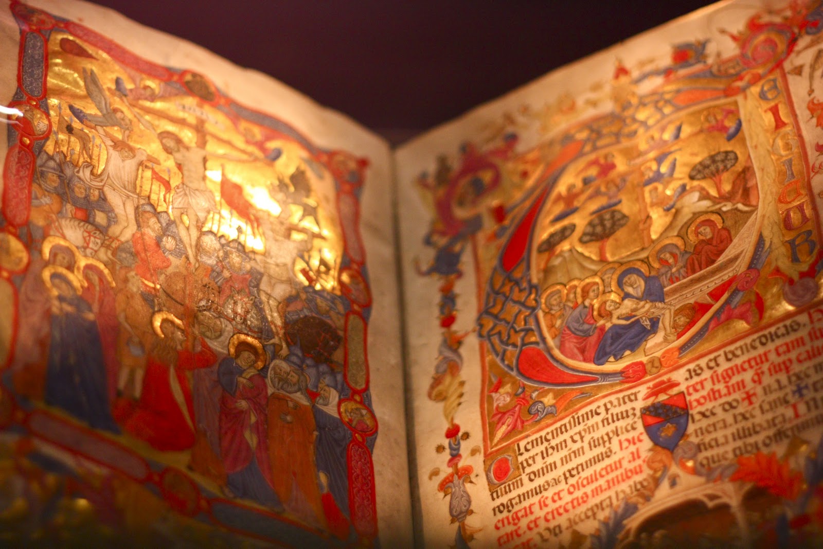
Historical Item for Blackburn Museum
Blackburn Museum is housed in a purpose built, slightly 'gothic' building which opened in 1874. It is world known for its collection of historical and religious books and houses more than the National Museum in London, although much of the collection is not on show due to lack of space, a mere 13% is actually showcased.
The museum itself is split into smaller rooms and collections that include;
Textiles and cotton industry
The Hart collection of books, manuscripts and religious artifacts
The Egyptian Room
Local History
Photography is allowed throughout the museum, but flash is not allowed in the Hart Room as this could damage the artifacts, and tripods are not allowed - which could make low light images difficult to capture without camera shake.
I had a visit with the group, but I also returned on my own.
I wanted to create images that would have multiple uses, either in promotional literature or as records for individual items, but I wanted them all to encompass the mood of the surroundings, so I didn't want to take things into a 'sterile' studio or lightbox. (The lightbox would be useful if the images were to be used for catalogue-ing items and is available for such situations)


The items that most interested me were;
The textile looms and spinning machines. Blackburn was a major player in the cotton industry and the preservation of these important local artifacts in essential if we are to understand our heritage.


The Japanese Kimono
Unfortunately, this is the only piece like this in the museum, so I was unable to take some images out of the glass case. I do however think the spotlights add to the mood and give a real sense of what it feels like to visit the museum.
All the embroidered images on the kimono represent something to the newlyweds, wishing them health, good luck and fortune for the future.

The ornate religious manuscripts
Having recently learned about their role in Art History, I was pleased to see a large collection of highly decorative manuscripts.
They are kept in illuminated glass boxes to help preserve their condition for future generations.
The building itself has some decorative features, such as stained glass windows, and ornate metal work.


In editing I tried to add various age-ing effects to some of the images as these seemed to feel right and a sympathetic treatment of the subjects

Final Image - Historical
I've enjoyed photographing the museum, and while I can only submit one for this brief, I am putting a collection together in a book. I need to discuss this with the museum, not only for permission, but it may be something they could use and/or contribute to.
----------------------